CAMP DAVID
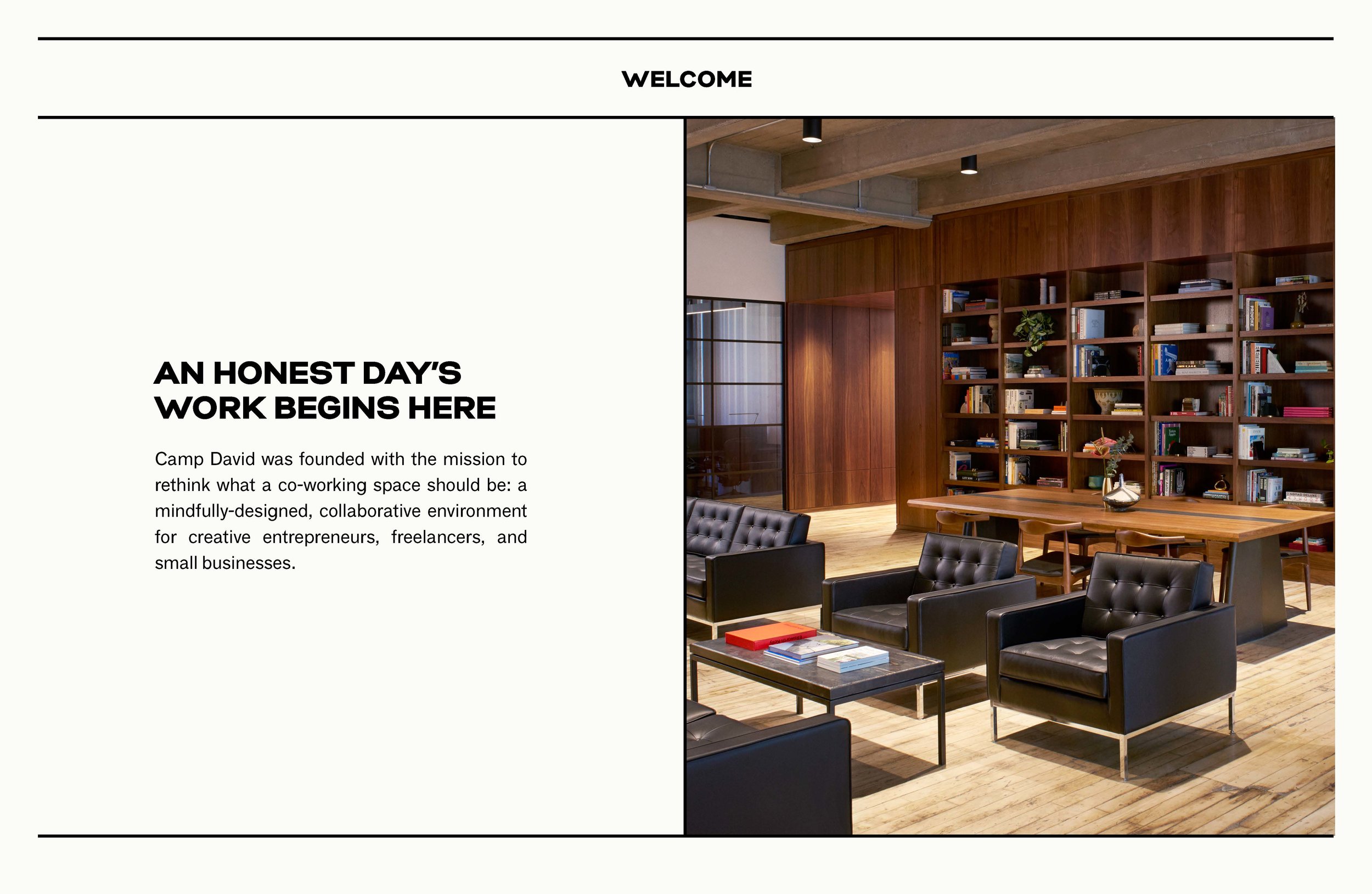
Camp David is a mindfully designed membership workspace created by Milk Studios co-founders, Mazdack Rassi and Erez Shternlicht, as a professional home to creative entrepreneurs, freelancers, and small businesses. I was responsible for managing the brand's website and print collateral, which included designing print materials, producing photoshoots, establishing web styles, and streamlining the functionality and design of their marketing website and member portal.
Research & Strategy, Art Direction, Collateral, UI/UX & Web Design
— 2016 - 2018
Identity & Print Collateral
CAMP DAVID MOOD
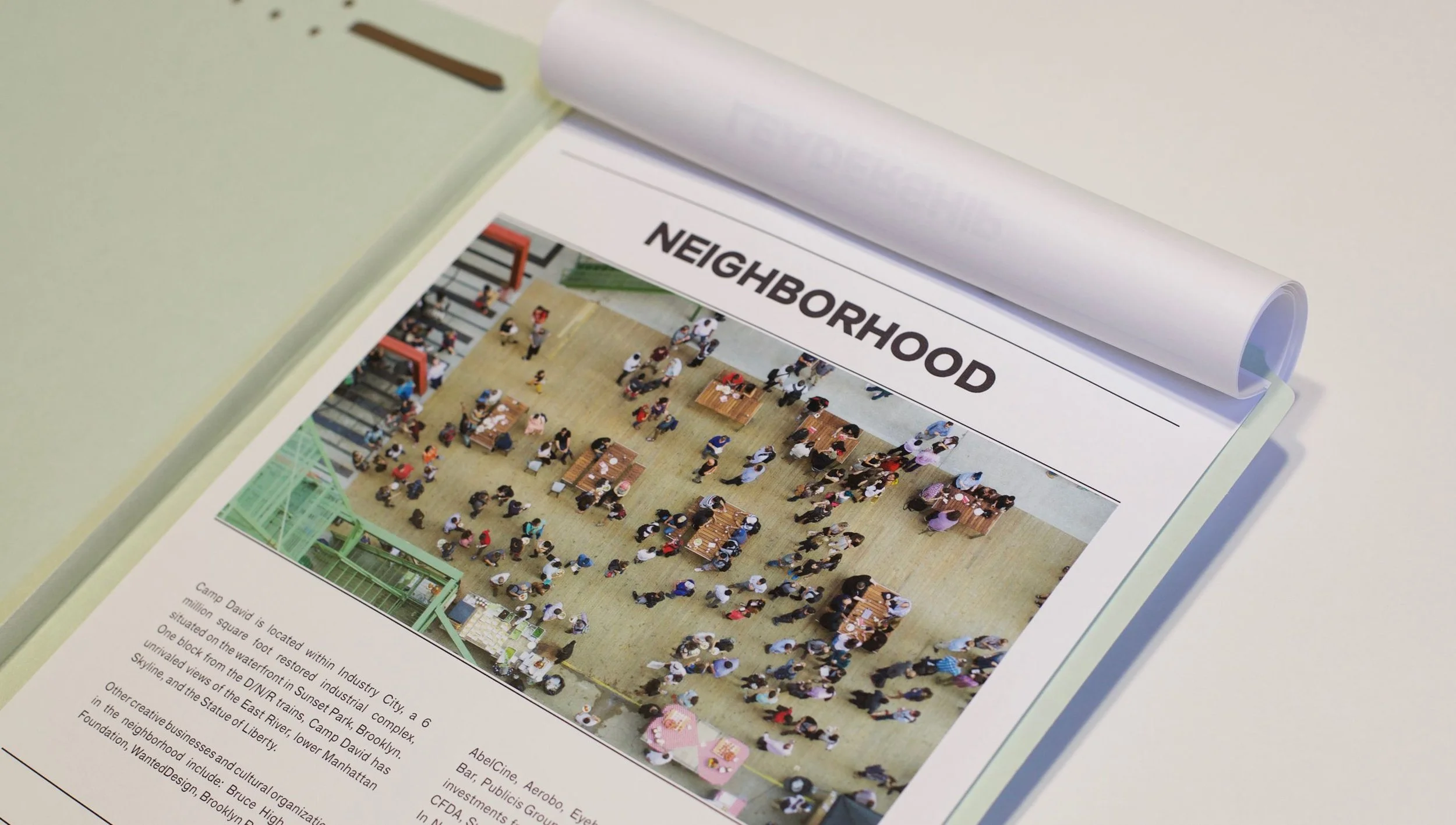
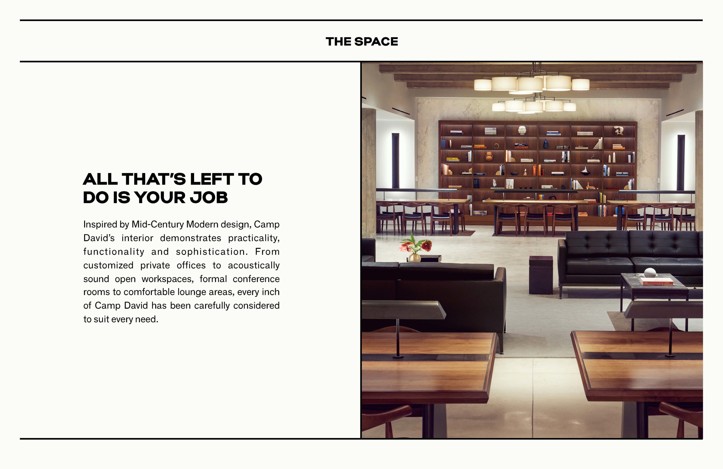
The inspiration for the brand was rooted in the 1960s – Mies van der Rohe, brutalist architecture, cocktail lunches, walnut board rooms — with a governmental touch: stamps, forms, newsprint, magazines. This influenced the design of everything, from the interior design to print materials and websites.

BRAND COLLATERAL
The Camp David branding was developed by Base Design. Working within their brand guide, I created print materials and collateral for the space. Pale peach letterheads, custom folders, and thermographic printed business cards all come together to give the timeless, tactile feel of the Camp David brand.


THERMOGRAPHIC PRINTING
Thermographic printing was used for a majority of the Camp David print materials. This process requires dusting the wet ink with a thermally reactive powder, then setting it with heat to give it a raised texture.
Capabilities Deck


Photoshoot
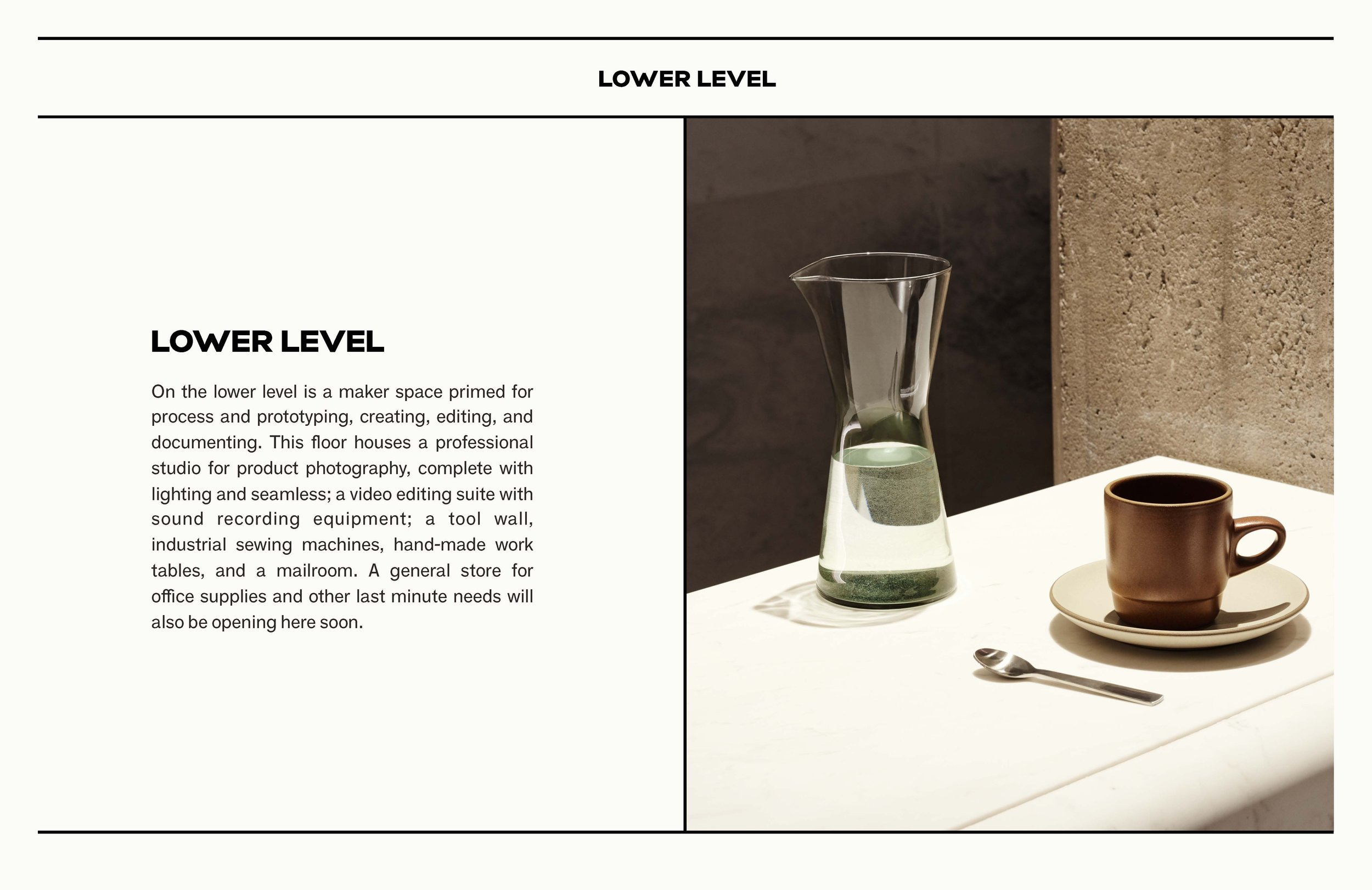
I was responsible for producing the first interior photoshoot of the new space. We chose to work with the talented, Thomas Slack and Danielle Selig, to focus on the grand scale and fine details of the space.


Web Design & User Experience
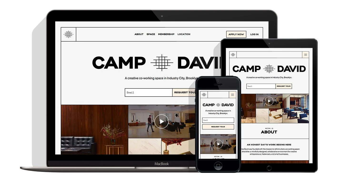
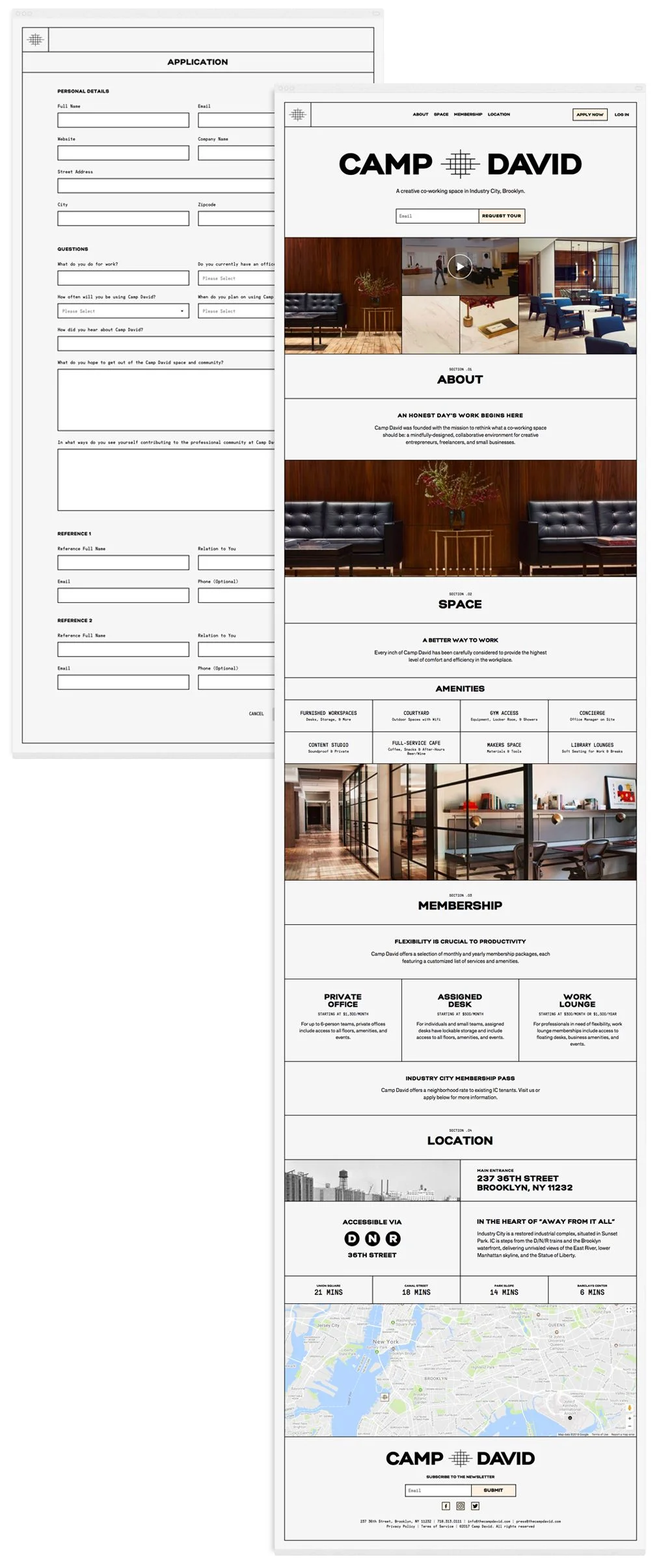
MARKETING SITE REDESIGN
We improved readability of the site by introducing a new typeface, added an input for users to easily request a tour, added an application page to streamline our process, added a video tour of the space, as well as an image carousel for visitors to get a nice feel for the space. We also restructured the site to improve SEO and ensured the site rendered well across devices.
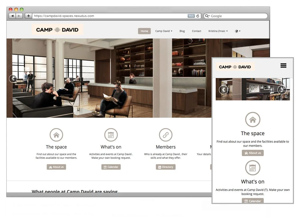
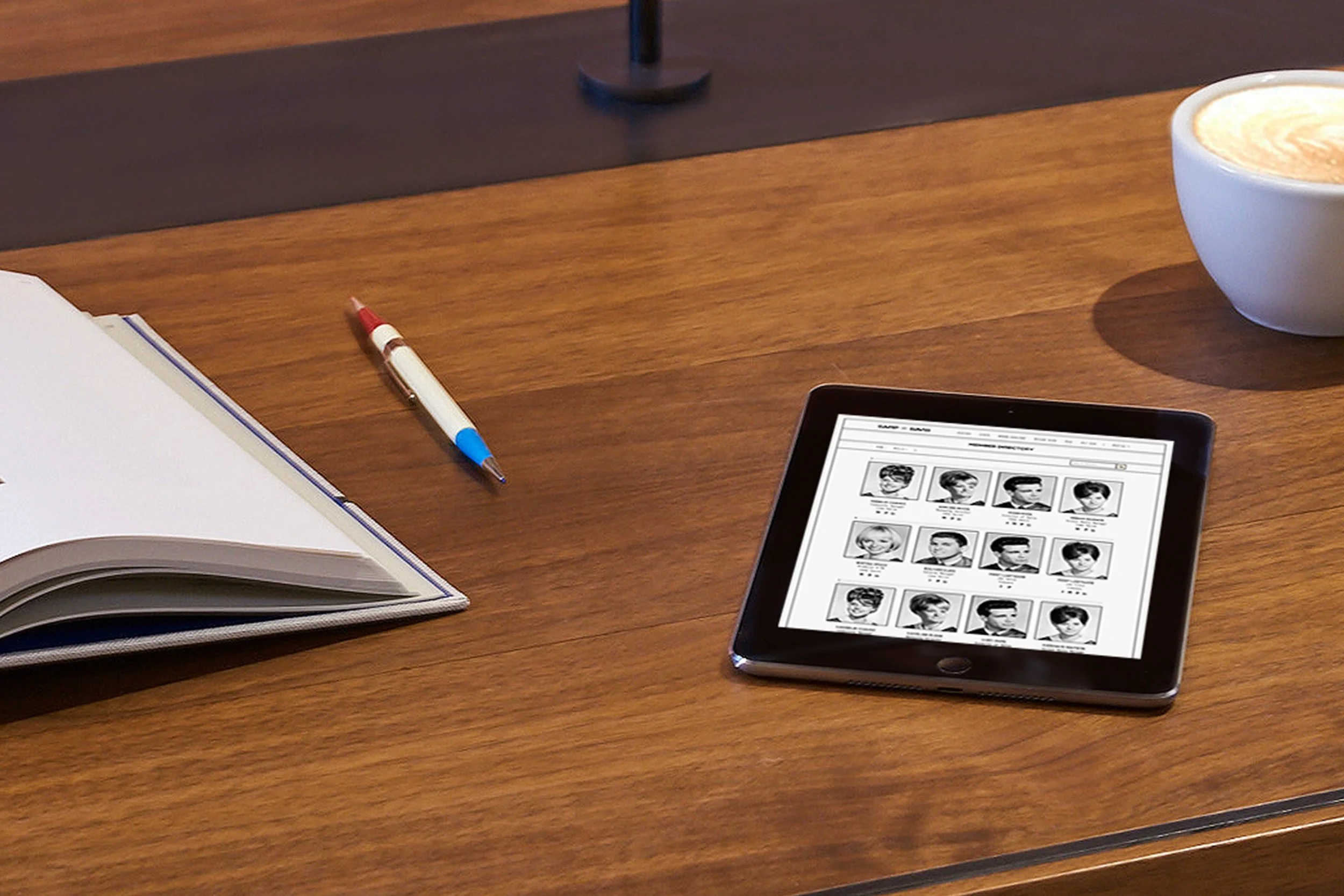
ORIGINAL MEMBER PORTAL
The Camp David team had chosen Nexudus as their member platform, an internal tool for members to communicate, book conference rooms, RSVP to events, and manage their billing.
I was hired to white-label and improve the overall user experience.
Site Goals:
• Responsive - platform was breaking on mobile
• Cohesive Branding
• UI/UX Clarity
MEMBER PORTAL REDESIGN
There were lots of challenges and constraints with white-labelling an existing product, but we managed to hit our goals.
The new responsive app embodies the Camp David brand – having a vintage newspaper aesthetic, as well as simplifies a lot of complex user interactions.
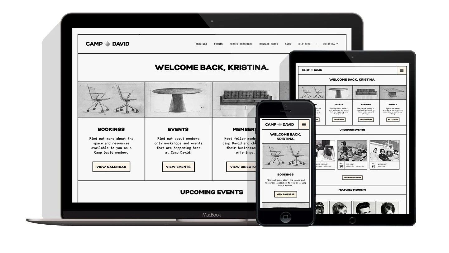
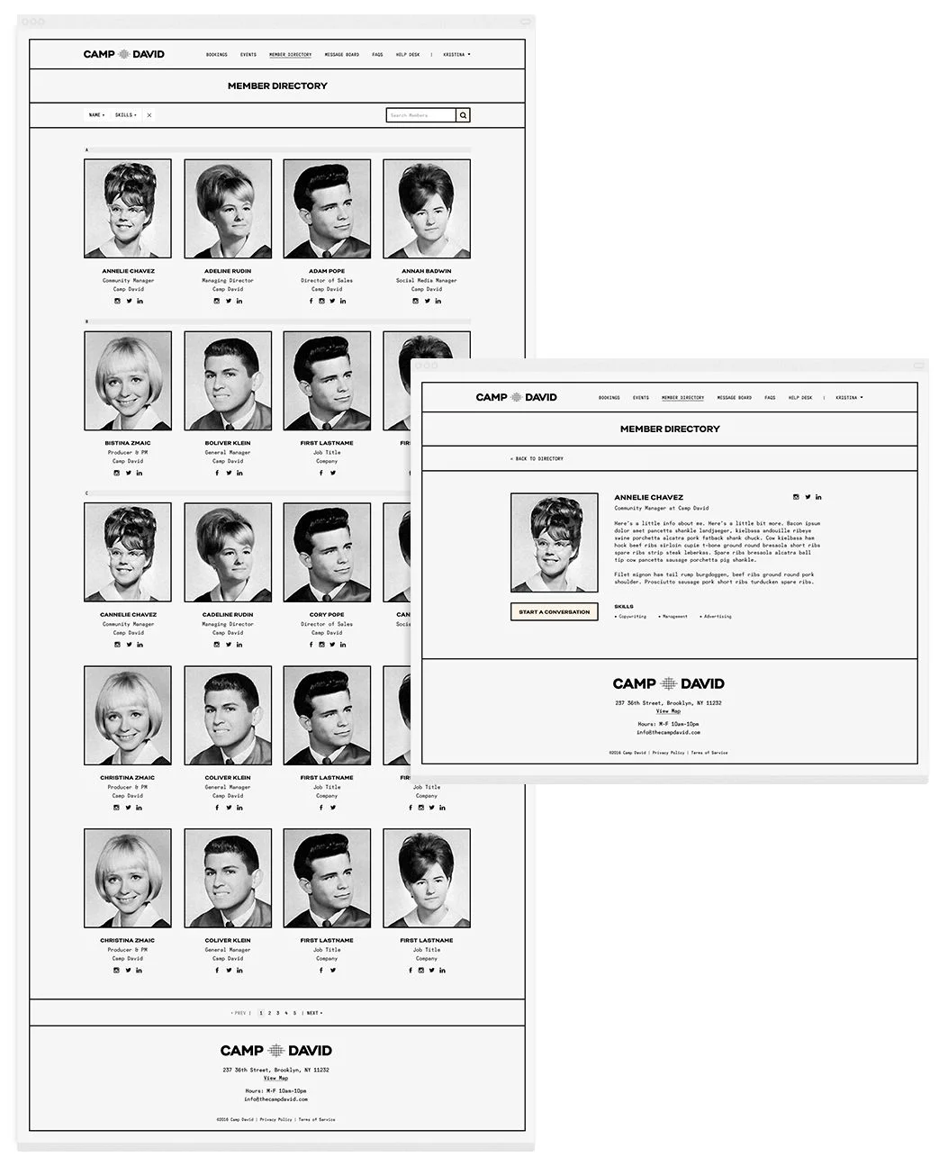
MEMBER DIRECTORY
The Member Directory allows members to have their own profiles and reach out to one another via the internal messaging system.
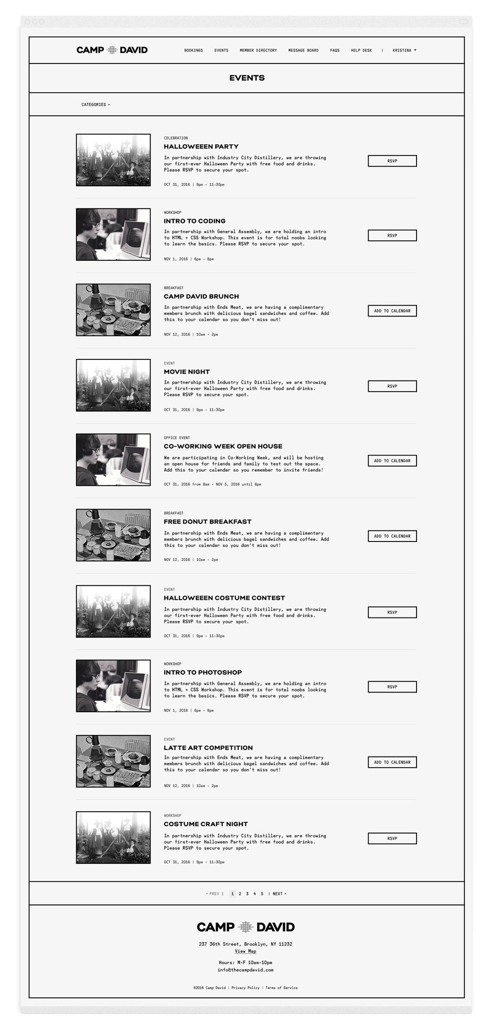
EVENT CALENDAR
The event calendar allows members to see what's happening at Camp David and RSVP from the platform.
BOOKINGS CALENDAR
Camp David has three floors, so booking various conference rooms becomes a bit complex. The bookings calendar has a "Resources" tab to allow members to have a visual of the floor plans and book conference rooms for each floor – or revert to the calendar view.
