Avroko’s Brand Bureau
Brand Bureau specializes in branding within the hospitality industry with a focus on designing scalable restaurants, cafes and hotels. Originally the in-house graphics department for AvroKO, Brand Bureau has grown into its own stand-alone branding agency within the AvroKO family. I worked closely with the BB team to create a site to fit their evolving brand. I helped re-design their web presence by focusing on market research, brand strategy, and UX design. The new site distinguishes Brand Bureau from their competitors by focusing on their main differentiator: branding & building scalable interiors for the hospitality industry.
Research, Strategy, UI/UX & Web Design

—
The goal for the new site was to create something clear and direct, with a distinguishing personality that could live alongside Brand Bureau's tactile branding and collateral.
The Audience

BUSY CLIENTS
BB's site audience is their clients, so the site needed to effectively display their work and services, while making it easy for clients to contact them.
Mood & Inspiration
ESTABLISHING LOOK & FEEL
Brand Bureau’s name evokes a playful sense of municipality. Under BB'S creative direction, feminine colors, patterns and textures were pulled as inspiration. The goal of the site design was to create something professional and modern, while finding places to be slightly weird and eccentric.

Web Design & User Experience

ORIGINAL WEBSITE
When I began on the Brand Bureau redesign, this was their site. The overall goal was to bring their cohesive brand online. They had already established a beautiful logomark, print collateral, and photography, but their site design felt a bit disconnected from their branding. We also wanted to ensure the site was fully responsive and improve the overall user experience by making the site more engaging and clear. How could we make this site stand out amongst the many competitors and make a memorable impression on users?
Site Goals:
• Fully-Responsive
• Engaging User Experience
• UI/UX Clarity
• Bring their Cohesive Branding Online - Bring a cohesive brand experience from their work & print collateral into their website.

FULLY-RESPONSIVE
The visual direction of the branding and the motivations of the BB audience helped to guide the site design and interactions. The new responsive site now provides a more seamless brand experience, no matter the device.
MOBILE-FIRST DESIGN
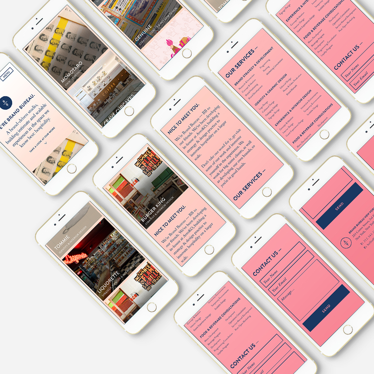
Based on our target user, we wanted to keep the site simple, clear and direct. We started with a mobile-first approach keeping the site to one page. Users can find all the information they need on this one-page site, and click on the project photos to see detailed case studies of their featured projects.

HOMEPAGE MOBILE VIEWS
The homepage provides users an at-a-glance look at projects and capabilities. Also note that the gradient gets deeper as you work your way down the page — a nice, subtle surprise.
MOBILE NAVIGATION
Making the navigation as simple as possible on mobile for ALL users, we chose to go with a clear and direct "Menu" button. Upon click, the button opens up a large list of menu options. Since this is a one-page site, each menu item pulls you down to a section on the page.

DESKTOP DESIGN EXPLORATION
After fine-tuning the mobile design, we moved into translating what the site would look like on desktop. We explored a few layouts and functionalities, but they weren't as slick or easy-to-use as the mobile site, so we kept on refining.


FINAL DESKTOP DESIGN
After exploring a few possible functionalities, we decided on keeping the site one-page and having the case studies become a modal when clicked on. Keeping things simple and minimal is always the biggest design challenge.

MODAL CASE STUDIES
The case studies become a modal when clicked on to help keep the one-page feel. This solution helps maintain a consistent user experience no matter what their device.


DESIGNED TO BE FLEXIBLE
Although the site design only displays 7 projects, I designed it to be modular and flexible enough for the team to add more projects as needed.
OPPORTUNITIES FOR “WEIRDNESS”
In our initial conversations about the look & feel of the BB brand, the concept of wanting something professional, yet slightly weird was a big topic of conversation. Throughout the design process I looked for subtle places to insert eccentricities, and the text logo for Brand Bureau seemed like an interesting space to do that.

—
The concept was to surprise and delight users by having 6-10 logo options so that it changes every time you refresh the site. This logo change helps to make the Brand Bureau name stand out and be more memorable by being a bit weird and unconventional. The more goofy and terrible the typeface, the better.
Wanna get your project started?
← Previous —————— Next →