Corri McFadden
Since the launch of our re-design of Corri’s fashion blog, her brand grew immensely – so much so that she needed to add a store feature as well as re-vamp the whole site concept. Her site needed to incorporate her videos from her VH1 Show, her weekly spots on a morning show, curated articles, in addition to launching a storefront for her new jewelry line. The result is a robust, easy-to-use, modular site that fluidly incorporates all of her content as well as housing a clean, user-friendly storefront.
Research & Strategy, Art Direction, Photo Editing, UI/UX & E-Commerce Design
The Audience

FASHION-FORWARD TRENDSETTERS
Corri's site attracts women with high-end designer taste, looking to get style inspiration & stay up-to-date on the top social events happening around Chicago & New York.
Mood & Inspiration

ASSESSING EXISTING PHOTOGRAPHY TO ESTABLISH MOOD
Since Corri's site relies heavily on images and videos, it was pertinent that we assessed what we were working with. Imagery is the biggest contributor to the mood of a site, and usually defines the color palette. Corri's style had established a very clear color story and provided us with a more cohesive direction for future photography.
Starting with Corri's images and existing logo, it became clear that the overall site design would need to be minimal so that her content could shine.

SITE COLOR PALETTE
Working with the graphic, high-end feel of my findings, I chose to work with a mostly black and white color palette. This will allow Corri's photos to stand out and be the prominent color on each page. There is a tiny pop of pink in Corri's logo, so that can be used very minimally as an accent color.
STYLES & TYPOGRAPHY
Corri needed a typeface that was tough and a bit elegant, which is why I chose two different typefaces. Yanone Kaffeesatz is a strong and slim typeface that works great for headlines, while Alegreya has a nice delicateness that looks great as body copy and has a beautiful italics.

Web Design & User Experience
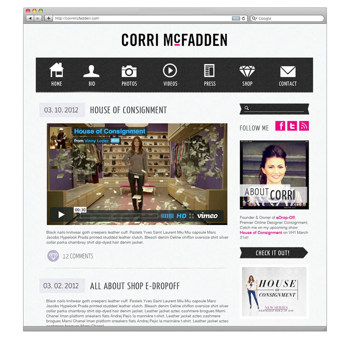
ORIGINAL WEBSITE
Corri's original site was created to be more of a scrolling blog format, but since she was pivoting her content strategy, the format needed to change. The new site needed to be a high-end fashion site as well as e-commerce store for Corri’s jewelry line. The design should be less “blog-looking,” and more like a publication so that featured content (ie. videos, photos, social media, etc.) will fit seamlessly within the framework. The new site should also have the ability for users to easily access and use the store, while still feeling like it's a part of the main site experience.
Site Goals:
• Clean, high-end look
• Easy integration of YouTube videos, Photo uploads & Instagram
• Establish an easy-to-use shopping experience
SITEMAP & FLOWS
Since this site was going to be a lot more complex than her last, we took stock of her content and created a sitemap and general flows.
After speaking with the developer, we decided it best to use WordPress for the main site and Shopify to handle her e-commerce.
Sounds like it'd be a little "detached" feeling, using two different CMS, right? It actually came out really seamlessly and users never felt like they had left one platform or the other.

LAYOUT & DESIGN EXPLORATIONS
Early layout and design explorations helped us to see the various ways we could incorporated fashion posts, social media, and store features. Since Corri's site is very photo-based, it was essential to mock-up these wireframes with actual images from her current site.

HOMEPAGE CONTENT LAYOUT & WIREFRAME

Content layouts were used to incorporate all the different elements and features we wanted on the homepage. These content blocks allowed us to identify what content was important to users on each page.
This is what the layouts above looked like without images added.

FINAL HOMEPAGE
After looking at the design explorations, we decided that this layout best featured all of the different content types in a high-end, elegant way.

SEAMLESS SOCIAL MEDIA
The incorporation of social media elements allows them to blend into the framework, opposed to being awkwardly and obtrusively slapped onto the page like you consistently see on sites.
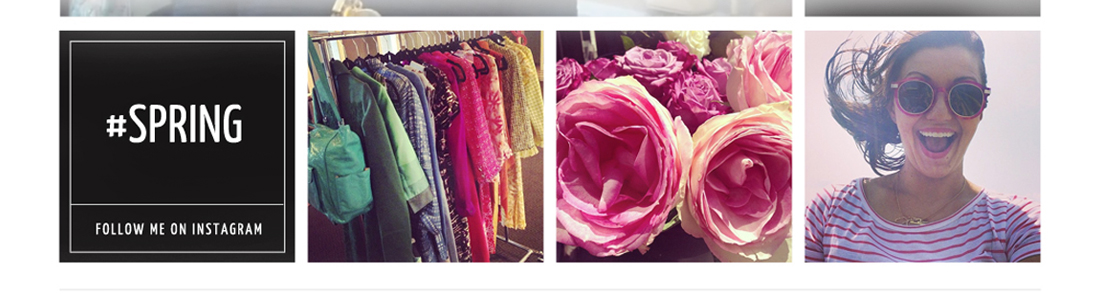
Corri's latest Instagrams would populate at the bottom of the page, or she had the option to manually change them. Manual was best, especially if she was focused on creating a hashtag feature or wanted to curate the look of what was shown.
The latest tweet would auto-populate but, in order to maintain the structure of the grid, the tweet would ellipse if it got to be too long.

ABOUT PAGE
The second most highly trafficked page of any site is usually the about page. We wanted to ensure that Corri's about page contained not only her bio, but also her brand collaborations and press sections. We wanted this page to provide a one-stop shop for anyone looking to get to know her brand better.
CONTENT WIREFRAME
Ensuring we provided users with what they were looking for in one place.

PAGE DESIGN
Bringing in copy and design assets to bring the page to life.

CATEGORY PAGES
Under Corri's main navigation she had a category list of featured columns she regularly curated. In order to keep these pages feeling consistent, we templated their landing pages & each post page.

CATEGORY: MUST HAVES
An example of an interesting category was one deemed "Must Haves." This page allowed her to generate a unique url to create a curated online shopping list. When users make a purchase from the links on Corri's site, she gets a percentage of the sale. Think Pinterest, but with incentive.
*This is not her storefront.
THE STOREFRONT
Corri's storefront needed to clearly display her new line of jewelry. We chose to create a simple, user-friendly shop that still brought in the look and feel of her main site. In the top right corner you'll notice a clear cart notification. Custom designed headers were created utilizing existing photography.


PRODUCT PAGE
Each product page had an image carousel to the right where users could flip through the product images.
Below the product feature is a "You Might Also Like" section of related items for the user to explore.
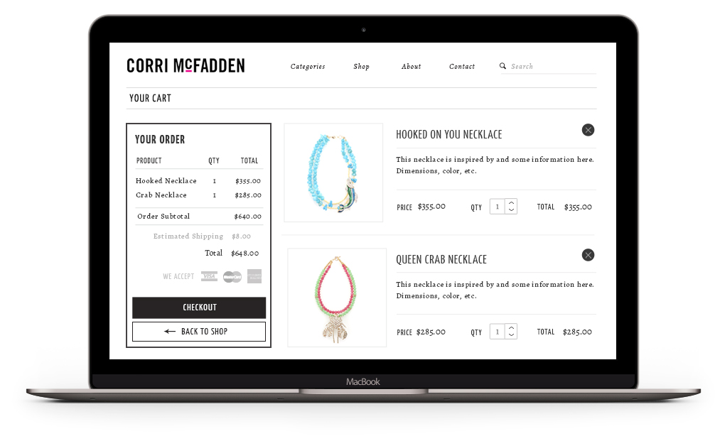
USER-FRIENDLY CART
When you click on your cart in the top-right corner, you land on the cart page with a visual list of your items and a summary of your order. Each item is easily removable and qty adjustable. Clear call-to-action to checkout or continue shopping if you'd like.