Grungy Gentleman
Grungy Gentleman was transforming its growing blog into an innovative men’s publication and creative house, aiming to redefine the cookie-cutter industry of men’s fashion publications.
My work evolved Grungy Gentleman into a respected brand and publication with creative partnerships, its own fashion line, increased user engagement, and higher ad revenue—leading to designing a Spring collection for Dickies and covering European Fashion Week in 2012.
Research, Strategy, Branding, UI/UX & Web Design
Audience

Urban Trendsetting Men
Fashionable, trendsetting men, with a little edge, come to the site looking for men's fashion, trends, and exclusive collaborations.
Branding & Identity
Logos
Based on the name, Grungy Gentleman, I wanted to create a mark that was a bit rough, yet refined. What came from that exploration were strong logo variations that could be used together or independently. Based on the logo direction, a variety of web elements were created.

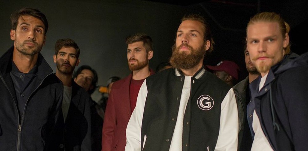
Spotted at Fashion Week
The online publication introduced its own fashion line. As you can see, the logo mark is versatile and recognizable enough to be used as a patch on this sharp baseball jacket.
Styles & Typography
The goal was to bring the pleasure of reading a magazine online, so GG needed typefaces that could bridge that gap. Gotham was chosen for headlines because of its sturdy, geometric characters. Georgia was chosen for body copy because it's a beautiful serif typeface that reads well on all screen types and works well for long-form body copy.


Custom Web Elements
Working with the angled look of the category tags, custom web elements were created for use throughout the site.
Competitive Benchmarking
Other Men’s Fashion Publications
Before starting on the website, we explored some of the well-known men's publications doing something that GG aspired to. GQ, Esquire, and Details all had a similar web presence. This allowed us to see how we could differentiate the new GG site.

Web Design & User Experience

Original Blog
When we began the Grungy Gentleman redesign, this was the website. The site had a large audience, but lacked an engaging user experience. Banner ads took up prime real-estate, copy was hard to read, and the overall design direction was confusing and inconsistent.
Site Goals:
- Mobile-First/Responsive
- Cohesive Branding & Design System
- Increase Engagement Metrics
- Increase Overall Usability
New Responsive Site
The visual direction of the branding and the GG articles helped to guide the site design and interactions. The responsive site cohesively incorporates the new branding as well as creates an enjoyable reading experience — one very similar to picking up an actual magazine.

Homepage
Large, gridded images were used to bring features to life. The header was used to display the latest feature, while the rest of the grid contained paid ads, social media, and a patchwork of featured categories.

Seamless Ads
Grungy Gentleman had a ton of ad relationships in place already, so it was a challenge to see how we could incorporate them into the new design without haplessly putting them in random places.
We decided to seamlessly incorporate them into the site design, much like a magazine would. There were three different ad sizes that could be purchased and easily added to the design without compromising the experience.


Defining Categories
In order to provide a better user experience, we needed to hone the categories and navigation. We took titles like "The Grunge" and "Mixtapes" and turned them into more recognizable categories.
After assessing the current articles on the site — and discussing the future of the publication, we determined that there were 6 different buckets that each fell into. We used those categories to create color-coded tags for articles, making it visually easy for users to "see" categories.
Category Landing Pages
Each landing page in the navigation is populated by articles tagged with that specific category tag. The homepage is a collection of featured articles from all categories.

Article Pages
Article pages had the ability to have a large image carousel header or a single image or video. Each article was created to have an editorial feel with a big focus on imagery.


Image Hot Spots
Images within articles have the ability to feature "hot-spots" which allow points to be placed on the x/y coordinates of the image. These offer a pop-up link to an item's web page or to be used to notate specific information on each item within a photo.
This works great for articles that feature curated articles of clothing and worked great for affiliate partnerships ($$$).
Post Launch Results
10K+
Average Monthly Visitors
3+
Pageviews/session
3+
Pageviews/session
Press & Collaborations
Collaborations with Del Toro Shoes, Kiel James Patrick, SINGER22, Dickies and launching GG's own fashion brand
Wanna get your project started?
← Previous —————— Next →