One Month
One Month is an online school for entrepreneurs that teaches courses to help students grow and launch their businesses. What began as a single Rails course, soon morphed into a Y-Combinator backed company. With this growth, One Month needed an all-encompassing designer to work quickly and efficiently in helping design their product and brand. I worked closely with the dev and marketing team to refine the branding, design growth experiments, and help bring cohesion to the chaos.
Interior Design, Research & Strategy, Art Direction, Branding, Collateral, Photography, Growth Strategy, UI/UX & Web Design

The Audience

TARGET USERS: WANTREPRENEURS
Working to align One Month's business goals with their audience, I dug deep into user testimonials, interviews and support tickets. Who were our students? What did they want? What were they looking for?
The One Month user is looking for an online school to help them quickly build and refine their product and business. They're looking for the authority and prestige of an ivy league education, but the relatability of a friend teaching them a skill.
Branding & Identity
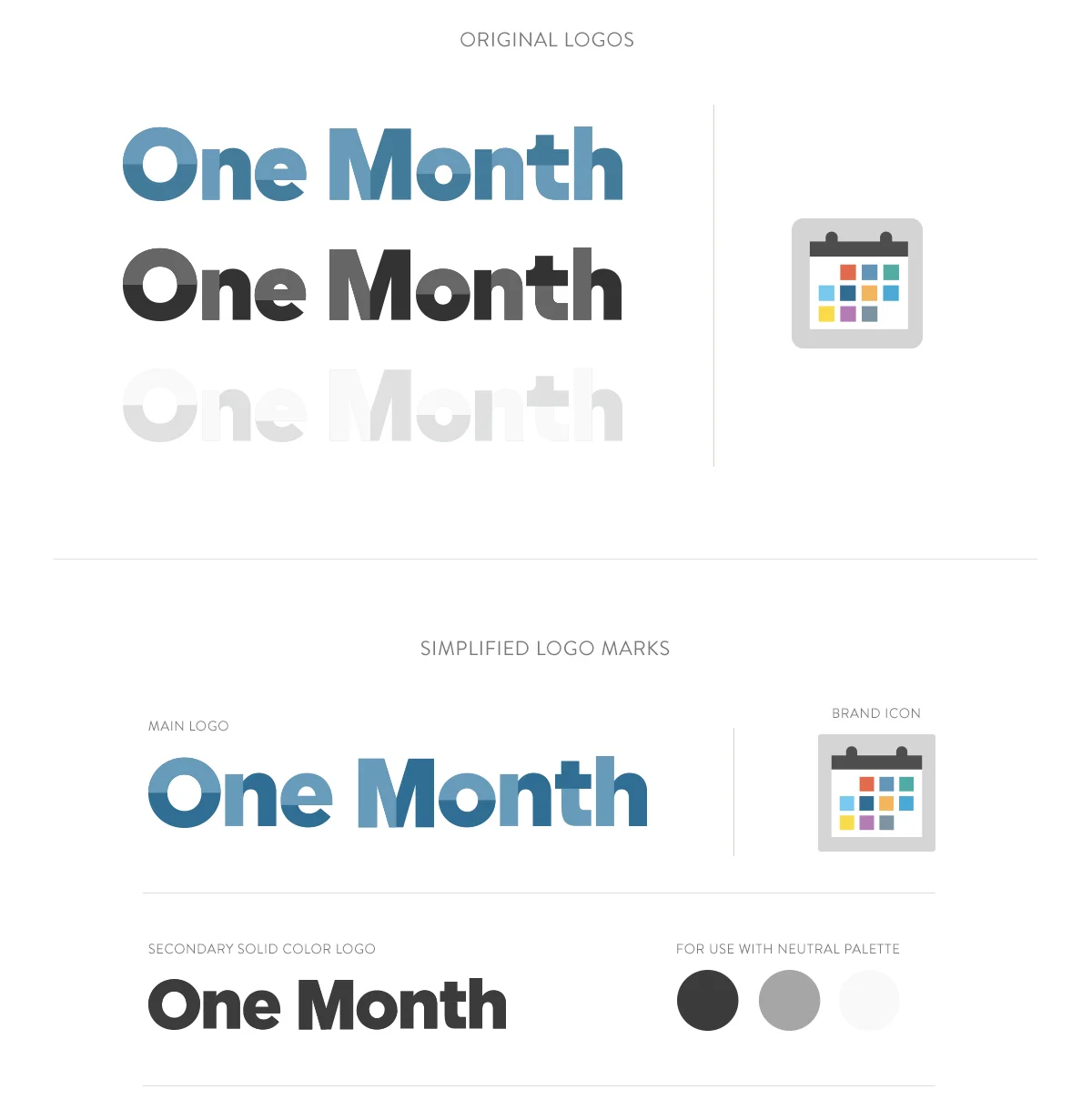
LOGO MARK
The One Month logo was already designed and being used across most of the brand's design and marketing materials. Since the logo had a wide presence, I worked to simplify its usage and design. The final, revised logos now have a hierarchy and clarity for use.
—
The blue logo is now iconic of the brand. Colors and kerning were adjusted, in addition to changing the type to Gotham. The brand icon is a little less rounded and is to be used minimally and as an accent mark — never large or next to the word logo. Since the two-toned logo is difficult to distinguish in smaller sizes, a secondary solid colored logo was created to be used in neutral colors.
MAIN COLOR PALETTE
Creating the foundation for the color palette was the logo. Neutrals were chosen for the website, while the trademark brand colors are rooted in blues.

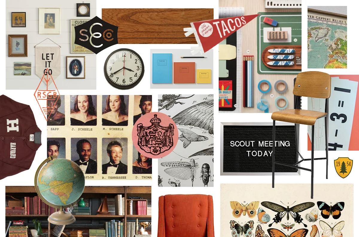
MODERN, BACK TO SCHOOL VIBES
After thinking about the company and the brand's personality, I established a mood board. Since One Month was rooted in life-long learning, I wanted to channel a back-to-school concept. The vibe needed to be prestigious, yet relatable and fun.
STYLES & TYPOGRAPHY
The original typefaces chosen for the brand were too difficult to read on the web, even at larger sizes, and didn't translate well for use in print materials. Gotham was chosen because it could be used big and bold on the homepage or print materials, but could also be readable at really tiny sizes that would be needed for the product's dashboard. I also wanted a complimentary typeface that would be pleasing to read in longer form text. Inspired by vintage books, Sentinel was chosen for body copy.


EXPLORING VERSATILITY
Because both typefaces come in a variety of weights, the combination of styles was endless. Experimenting with different weights and thicknesses, as well as playing with each typeface as a headline and in body copy gave us three different looks to try.

Branded Merch
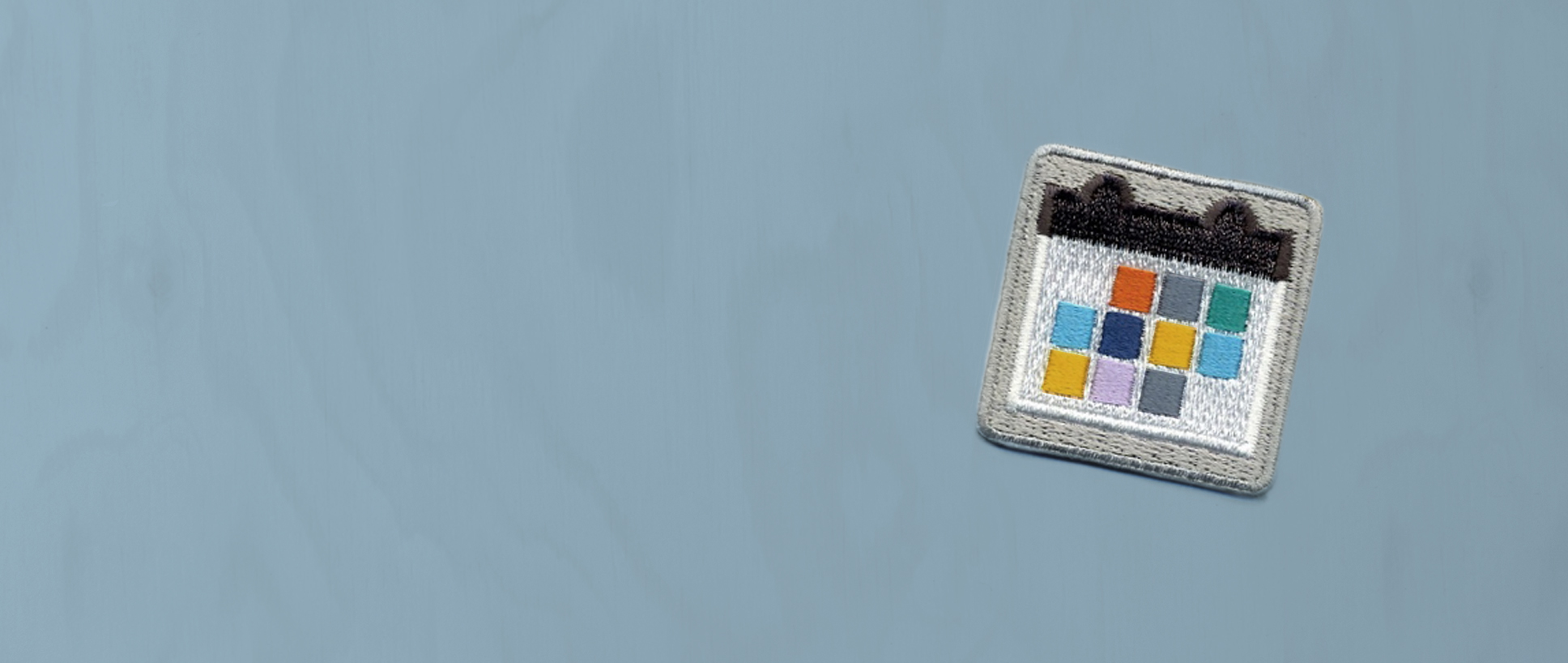
CUSTOM PATCHES
Based on our collegiate inspiration, we sourced a company to create custom patches for One Month to hand out at events. Patches were created in the brand colors and could be used to customize hoodies, backpacks, jackets — you name it. The patches were a subtle nod to the One Month brand, which we hoped would encouraged people to wear them more without feeling like they were decked out in branded merch.
BRANDED WEARS
INSPIRATION
Since the One Month brand is fun, with a touch of prestige, I looked to vintage Ivy League shirts and jackets to draw inspiration for our own branded shirts and sweatshirts. Nothing is worse than getting another branded t-shirt with a logo covering every inch of it, so for the One Month branded apparel I wanted to find a balance of branding and something you wouldn't mind wearing everyday.
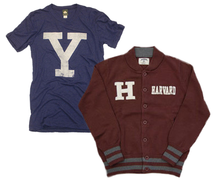


T-SHIRTS & PATCHED HOODIES
Heathered jersey in the One Month color palette was used to create branded wear. We had light blue t-shirts printed, and heat-set patches onto hoodies. Subtle, comfy, and wearable on a daily basis.
Brand Photography
PHOTO ART DIRECTION
The Muse had asked One Month to be a featured business on their listing, so photos were needed for their post. Since photos are the biggest attributors to the mood of a brand, it was pertinent that we kept consistency with art direction. I took bright, detailed photos to help tell the One Month story through the team's personalities. The branded interior design really helped establish the ambiance of each photo.

Web Design & User Experience

ORIGINAL HOMEPAGE
When we first started on the One Month redesign, this was their site. Although the site had a relatively direct user experience, it lacked brand cohesion and clarity. Our goal for the site was to bring in the refined branding, as well as make the user experience more engaging and clear.
Site Goals:
• Responsive
• Cohesive Branding
• Engaging User Experience
• UI/UX Clarity
• Help Increase Email List
NEW RESPONSIVE HOMEPAGE
The visual direction of the branding and the motivations of the One Month users helped to guide the site design and interactions. The new responsive site now showcases the refined branding as well as clearly displays the courses offered.

HOMEPAGE
We A/B tested a couple versions of the homepage and this one won. It ended up converting over 100% more than the other layouts. The homepage has a simple features block, video from the blog, and then the full list of courses offered. One of the goals was also to help increase the email list, so a CTA for blog updates anchors the page.

NEW COURSE NAMING STRUCTURE

ORIGINAL COURSE NAMES
The original course names were mostly rooted in the name of the programming language that was being taught. Since we had realized that most students were more interested in what they would build in the course, I worked to restructure how courses were named to make them more user-friendly.

NEW COURSE NAMES
Just because you're a wantrepreneur doesn't mean that you know or understand all the tech lingo, so I worked to make the course names more user friendly. The new names are now related to the projects you would be doing in the course, and also have the programming language title listed — in case you were someone coming to the site to specifically learn a language. The new naming appeals to a broader audience and is a bit less intimidating than the old naming structure.

SIMPLIFIED COURSE TILES
It was quickly realized that having an icon for each course wasn't very scalable when multiple courses were being released at a time. Having limited design resources, I focused on simplifying the course tiles. Instead of an icon, each course is color-coded which allows anyone to quickly add new ones. This was my solution to create a simpler way to scale design.


DIFFICULTY LEVEL
As new courses were being developed, there became a need to indicate experience levels of courses. The new course tile design was flexible enough to easily accommodate placement of difficulty levels in the right-hand corner.

Course Design
COURSE DESIGN ELEMENTS
Every course had a design cycle that I worked to hone and improve. If a course was being planned, I needed to take necessary steps to ensure that the information was up on the site. Most of my time was dedicated to organizing the design elements of each course. Structure was incredibly important to keep things moving forward with such a small team.

WORKING COURSE TITLE
When a concept became a course, I would work with the Dean of courses to flesh out a working course title based on our new naming structure.
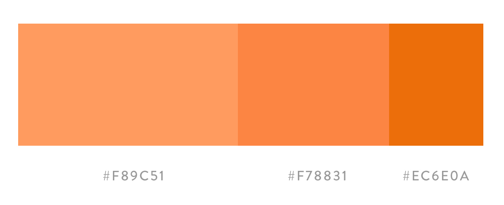
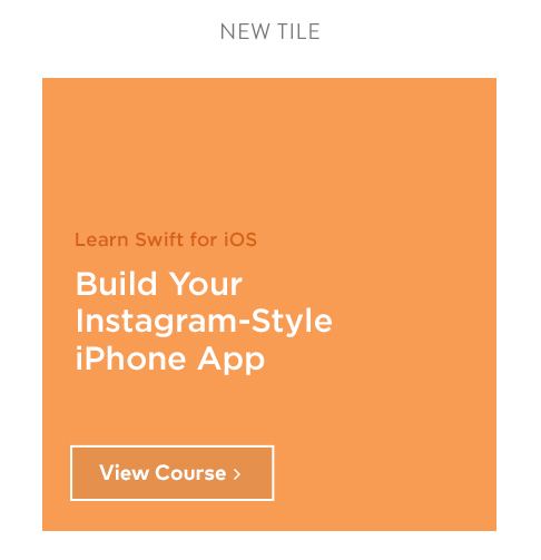
COURSE COLOR PALETTE
Based on the courses already created, I'd work to develop a palette that could live nicely with the other course tiles. One hue was chosen as the main course color, along with two deeper values of the same color.
COMING SOON COURSE TILE
A course tile was then created from the established elements. This allowed us to let students know we were working on a course for them and to expect it in the near future. This would link interested students to a splash page.


FACEBOOK AD DESIGN
Working closely with the director of growth, I designed a Facebook ad for the new course.

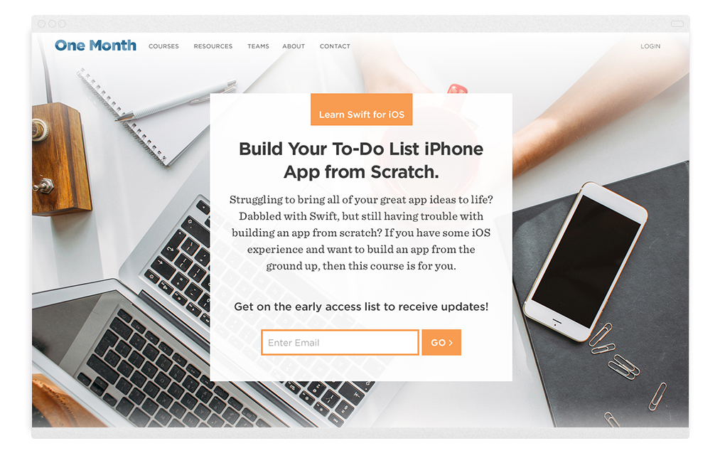
PRE-LAUNCH PAGE
We needed to put up a page for students to read more about the courses that were coming soon. A small brief of the course and an email capture were put in place so students could keep updated when the course launched. I also worked to implement a survey for prospective students to gauge their interest in specific course content.

COURSE LANDING PAGE
Once a course was ready to launch, a landing page needed to be put together. I coordinated with instructors and copywriters to ensure everything was in place and ready to go before pushing the landing pages live.
Blog Design
ORIGINAL BLOG
One Month wanted to ramp up their blog presence and migrate content over to a new platform. When we started the redesign, this was the blog. Our goal for the new blog was to bring in the new branding, help increase email sign-ups, as well as make the user experience more fun and engaging.
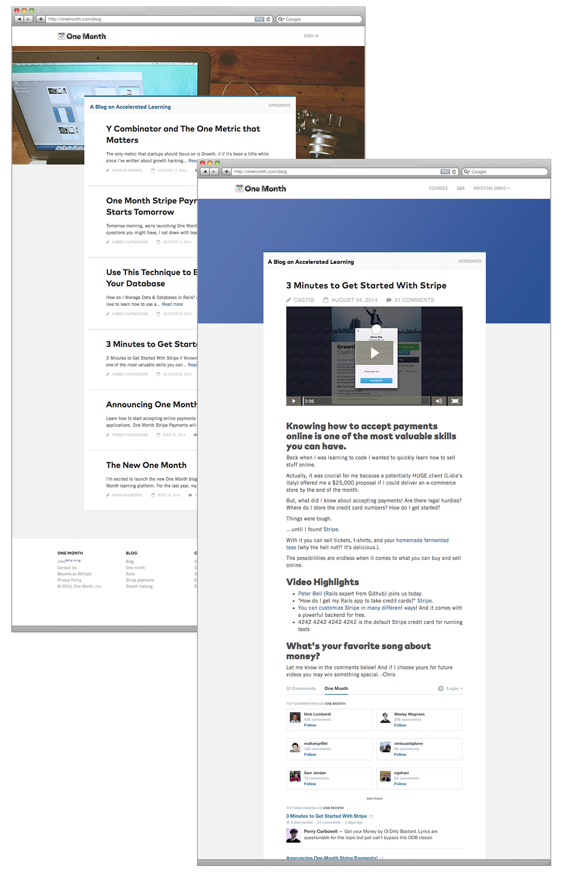
NEW RESPONSIVE BLOG
I wanted to make the blog more visual, since there were plenty of photos, videos, and illustrations that had been created. The new, responsive blog is more compelling to click, as well as read.

NEW BLOG DESIGN
We did a quick, one-week sprint to redesign the new blog and migrate the content to a new platform. In the final implementation we ended up nixing the large header image on the main landing page in order to save time. The new, more visual design makes the blog fun and engaging.

Wanna get your project started?
← Previous —————— Next →