SaaS CMP & Freelance MarketplaceContently
Feature-rich, but hard to use.
A SaaS Content Marketing Platform backed with a vetted Freelance Marketplace that helps enterprise companies collaborate, execute, and scale their content marketing efforts with top industry talent.
Think “Google Workspace,” created with Content Marketing Teams in regulated industries in mind.
Goal
Making a feature-dense platform easy to navigate for every user.
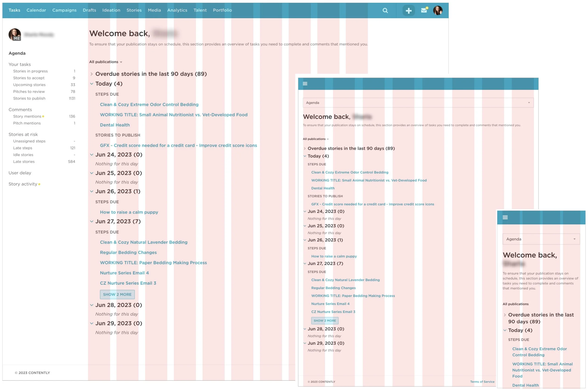
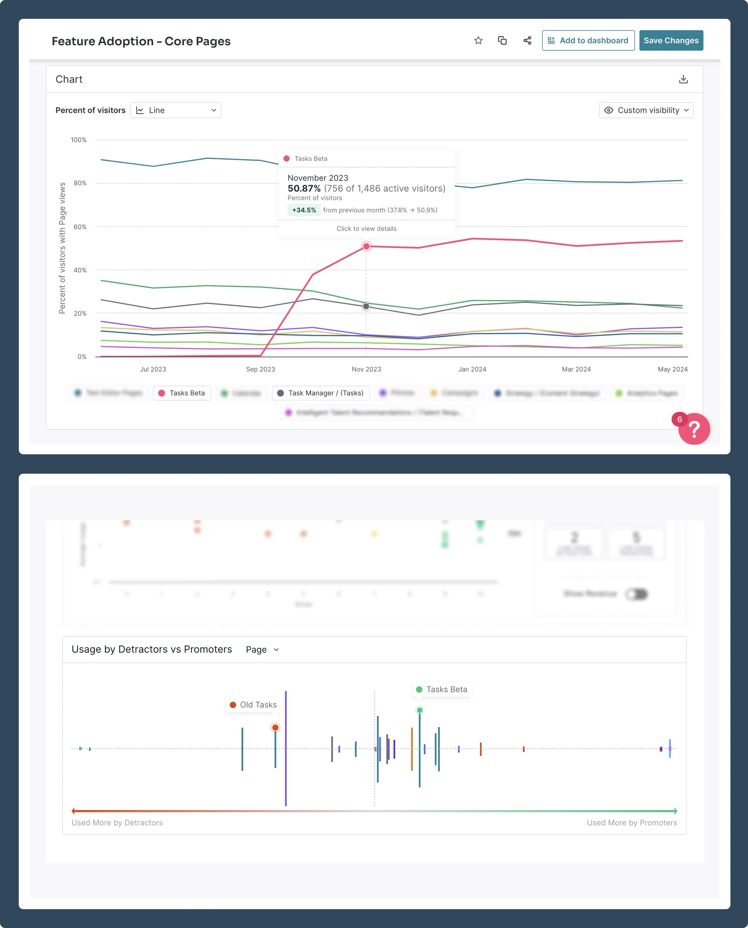
Redesigned a hidden feature into a personalized Tasks Page with a clear to-do list, bringing functionality to parity in a user-friendly way for both legacy and new users. Within weeks, it became the #2 most-used page across the platform, with users giving 9+ on NPS surveys.
Lead Designer & User Researcher
- User Interviews
- Design System Update
- Component Library
- UX/UI Design
- Usability Testing
- QA
Timeline: 8 Weeks
- PRD-to-Design: 2W
- Dev: 8W
Results
- 50% Adoption
Within 2 Months - 98% Fewer Bugs Reported
Compared to Prev Feature Launches 😱 - NPS "Promoter" Status
Users giving 9s and 10s on NPS Survey
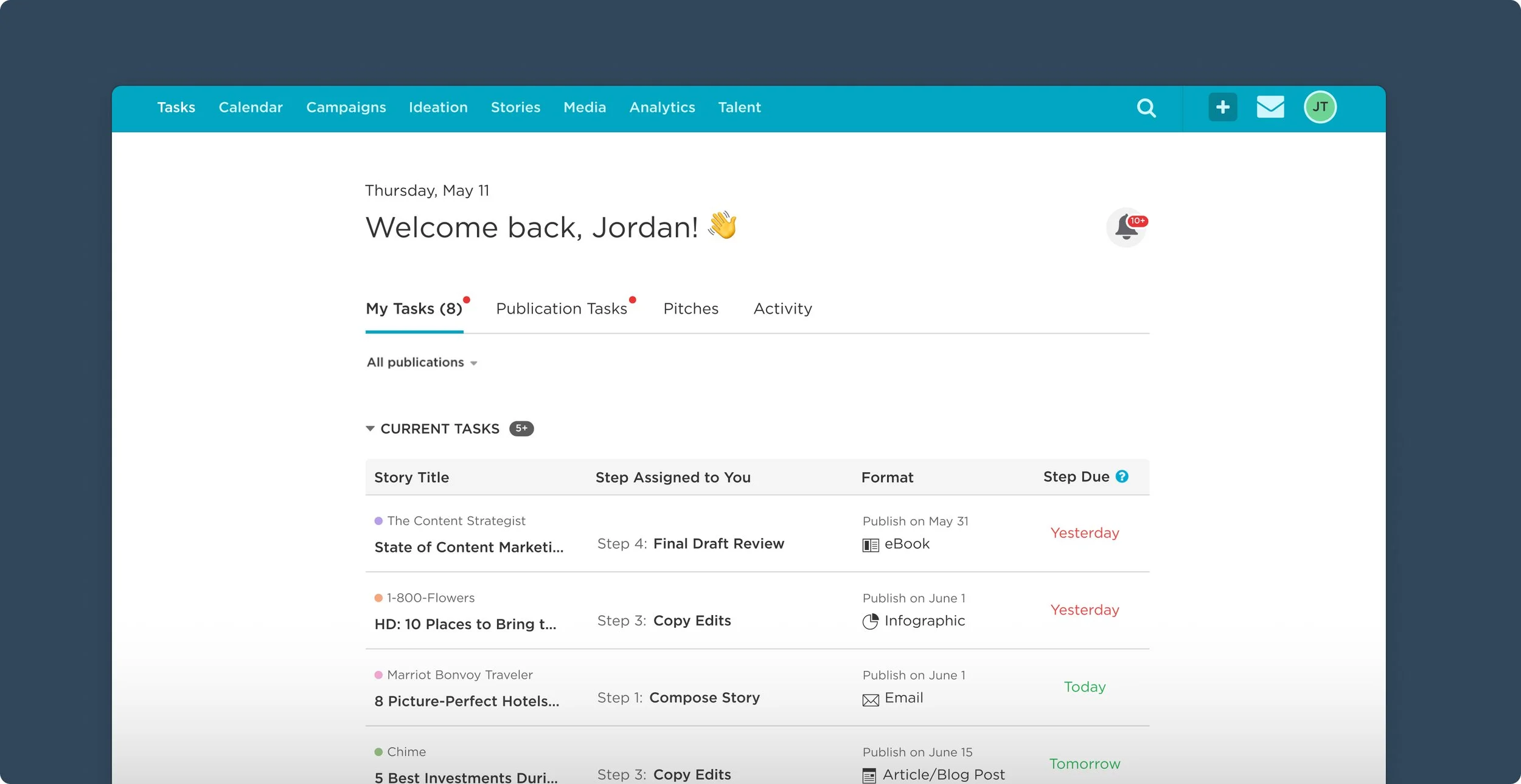
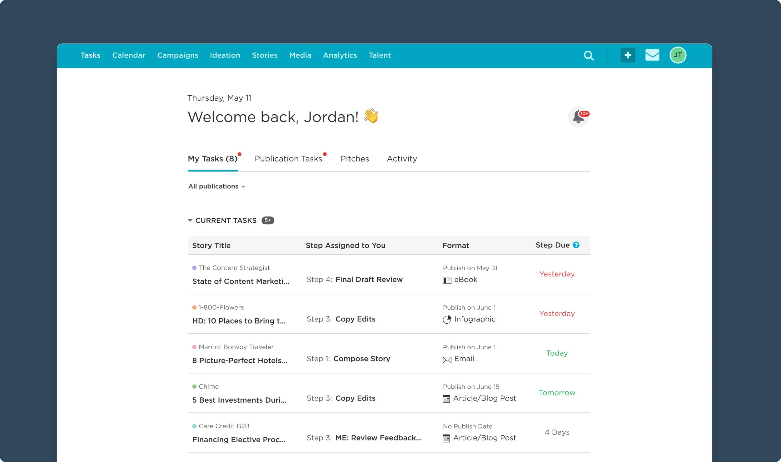
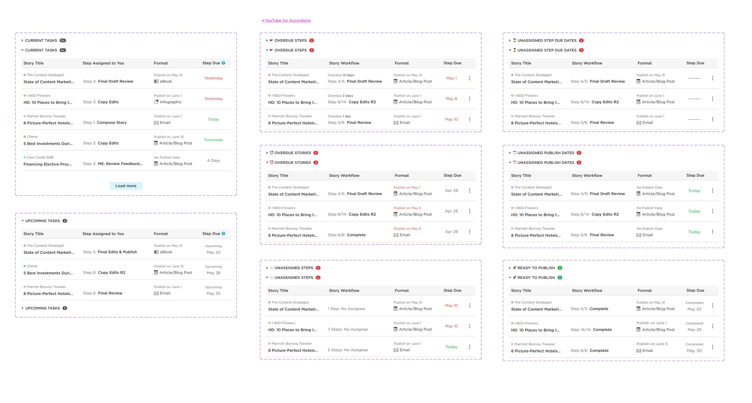
THE SOLUTION
A personalized Tasks Page with a clear to-do list
We uncovered a hidden, clunky Tasks feature that was already well-integrated across the platform. Reusing it reduced Eng lift, allowing us to prioritize a clean, user-friendly experience.
THE PROBLEM
Feature-rich,
but hard to use
Unable to find their projects, over 50% of users gave up on using the platform within the first month. Power users made it work, but broader teams struggled—leaving adoption low, account churn high, and sales difficult.
Over 50% Users Quit
Login Within 1st Month
Only 16% Retention
After 10 Months
Less than 1 in 5 Users
Login past 10th Month
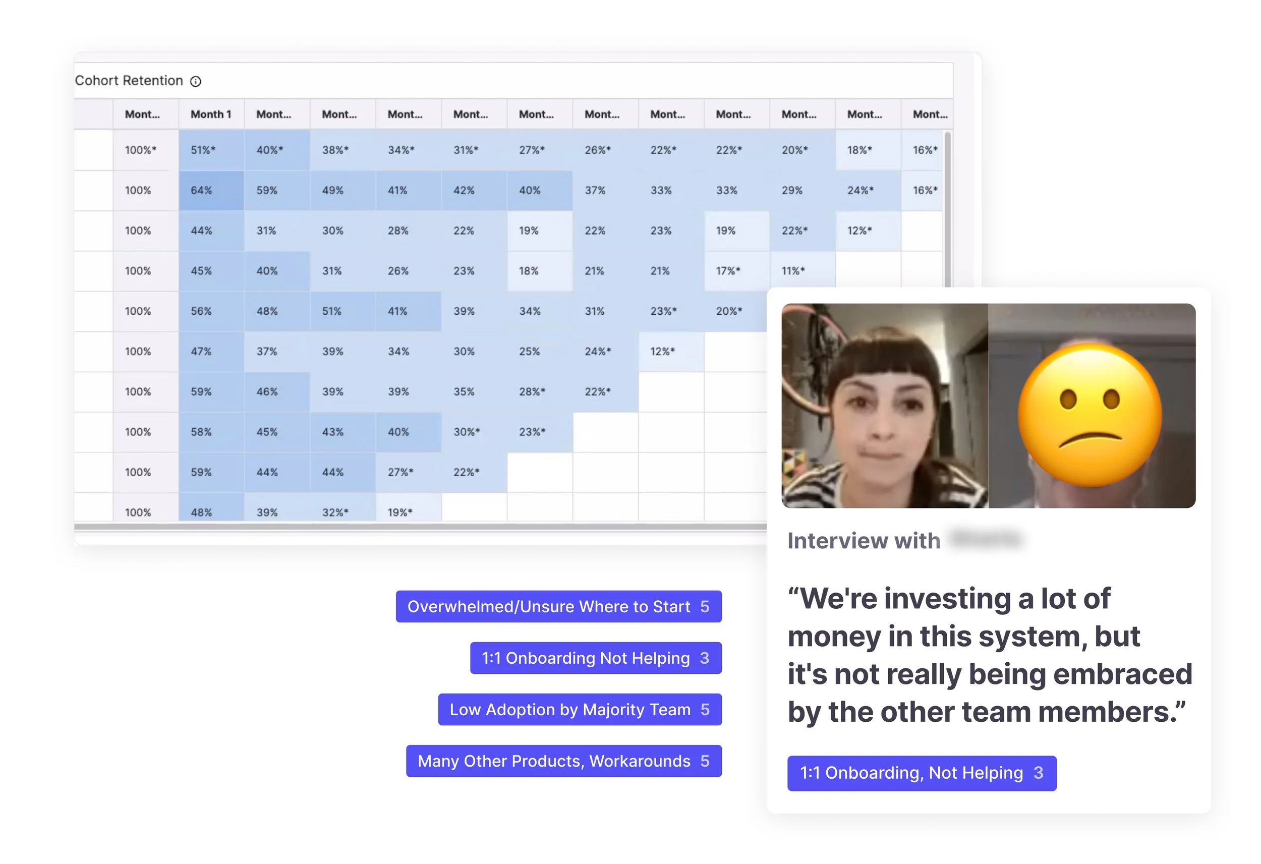
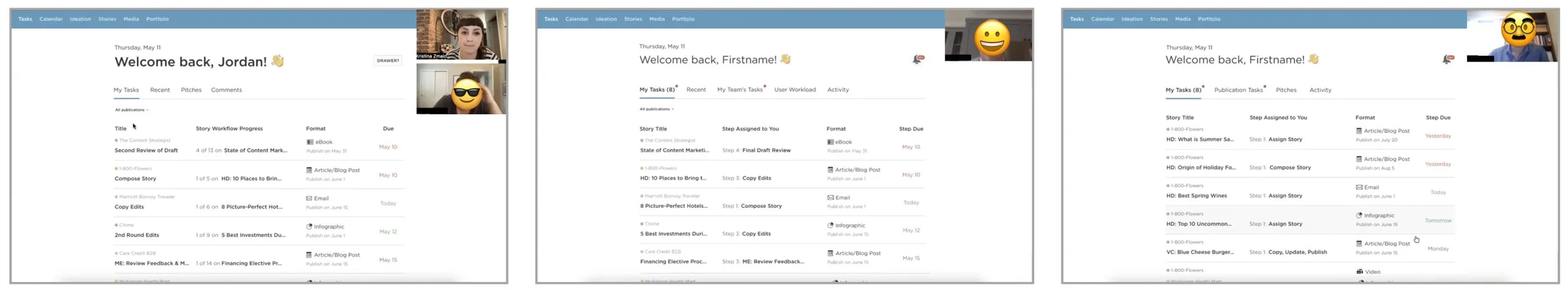
USABILITY TEST
Find Your Project!
Took over 20mins to find the project they were assigned. Conducted usability tests with 5+ users.
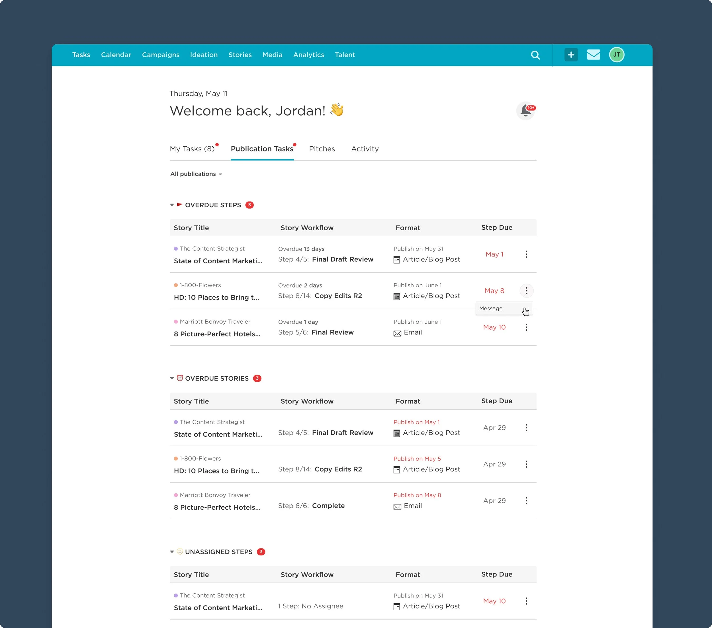
Designed to parity
Ensured all features were accounted for as well as the responsive breakpoints across the 13yr old app to increase Eng velocity.
Tasks Page Design
Over 50% adoption within 2 months—proving demand for a clearer entry point.
Modernized Tasks Page: clear hierarchy, dense info made scannable, which was well-received by both legacy and new users.
Ensured parity and responsiveness (aligned with product’s existing media queries)
Focused interactions: scannable tasks, accordion tables, and making next steps obvious
MODERNIZE SIMPLY
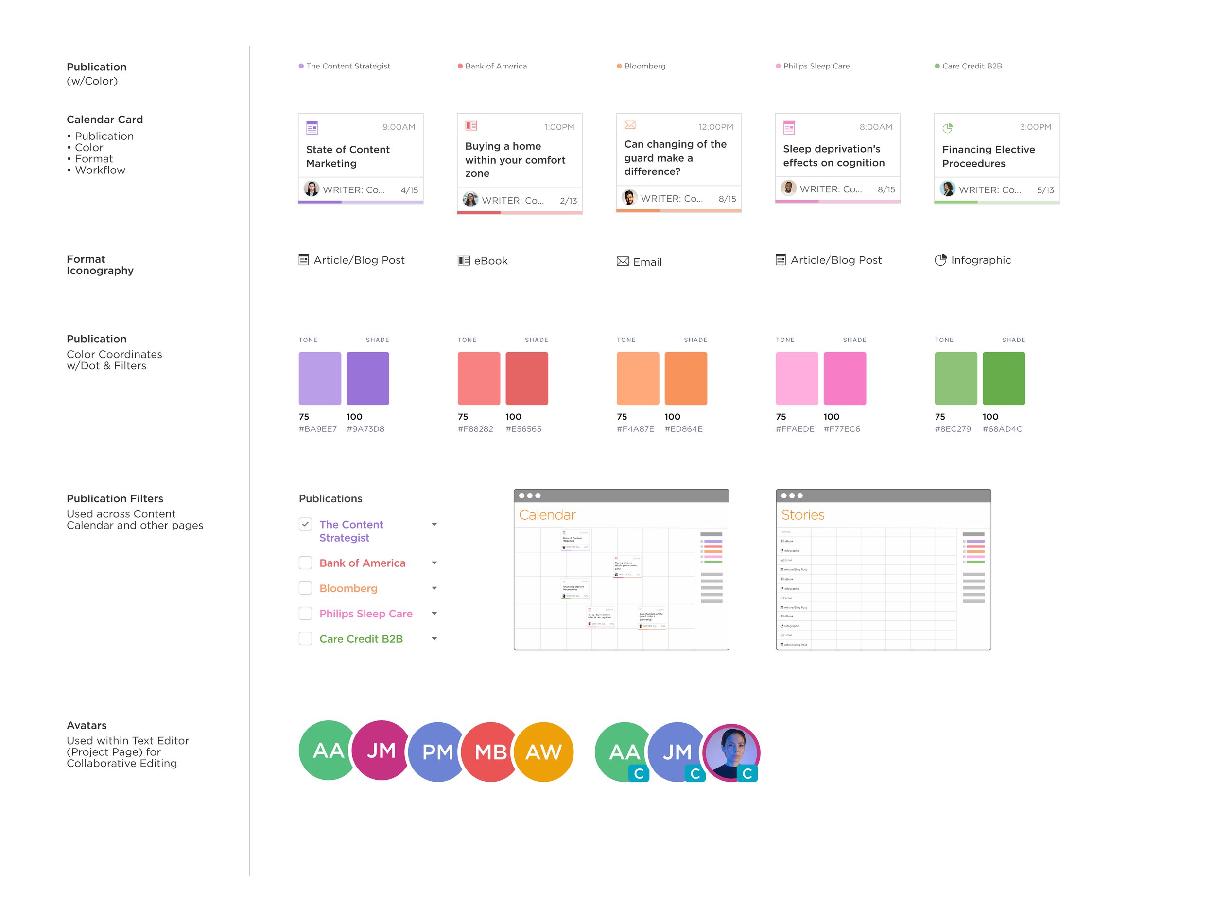
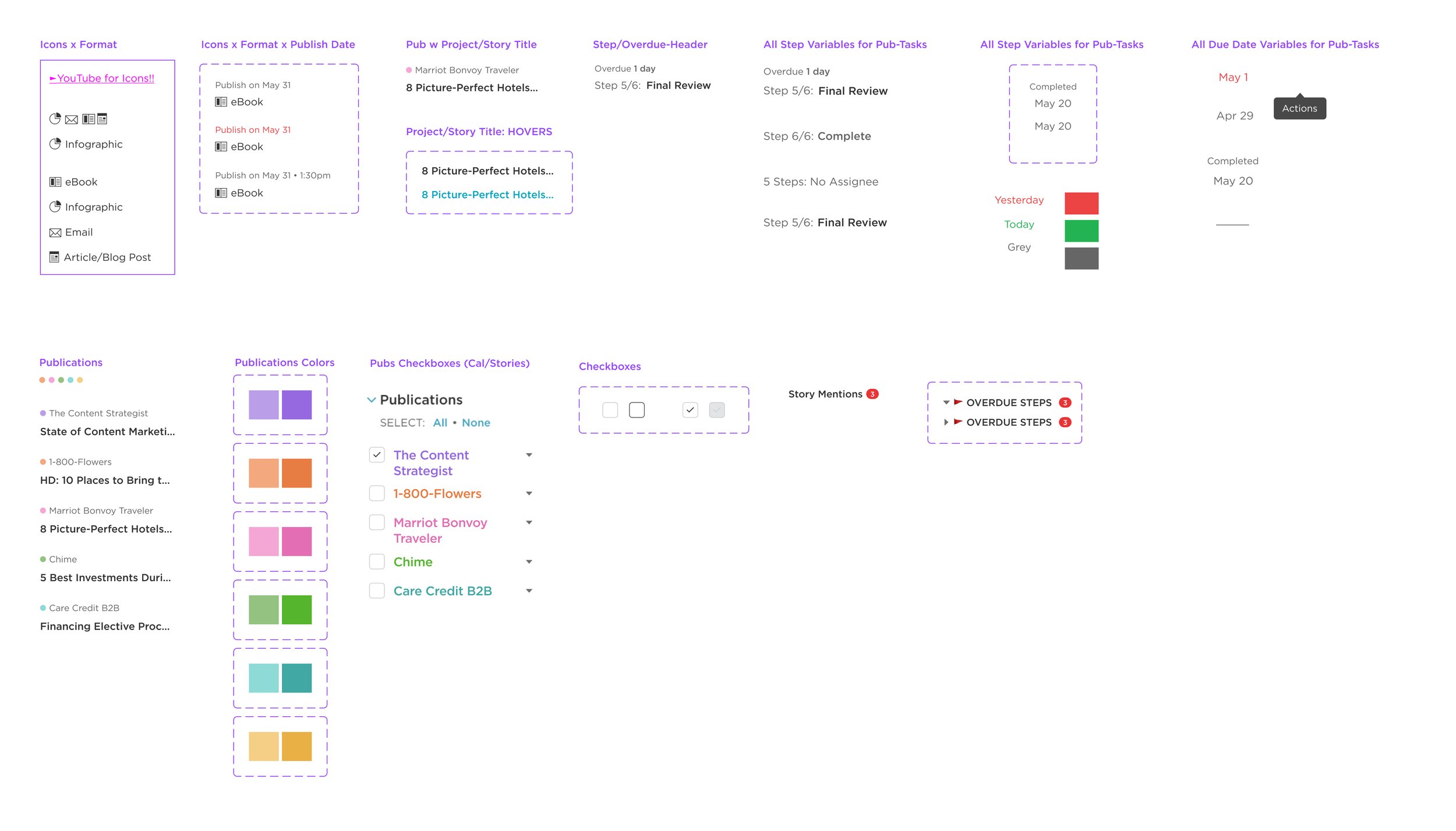
Design System Update
7+ years without a Product Team, the app felt clunky, dated, and unpolished compared to modern, user-friendly standards.
Moderated Usability Testing
Conducted 5+ usability tests to balance legacy and new user needs, refining the design to strike a happy medium.
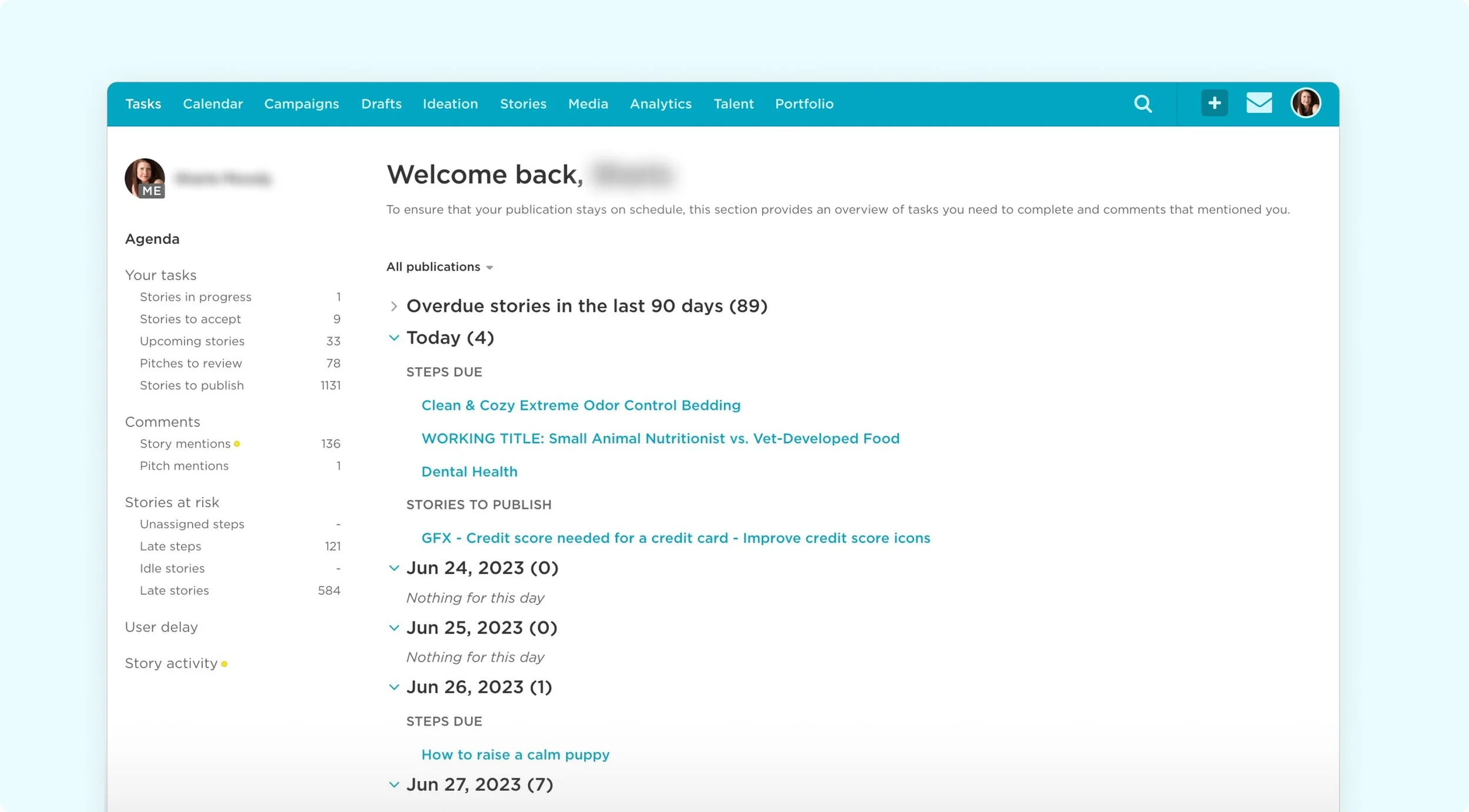
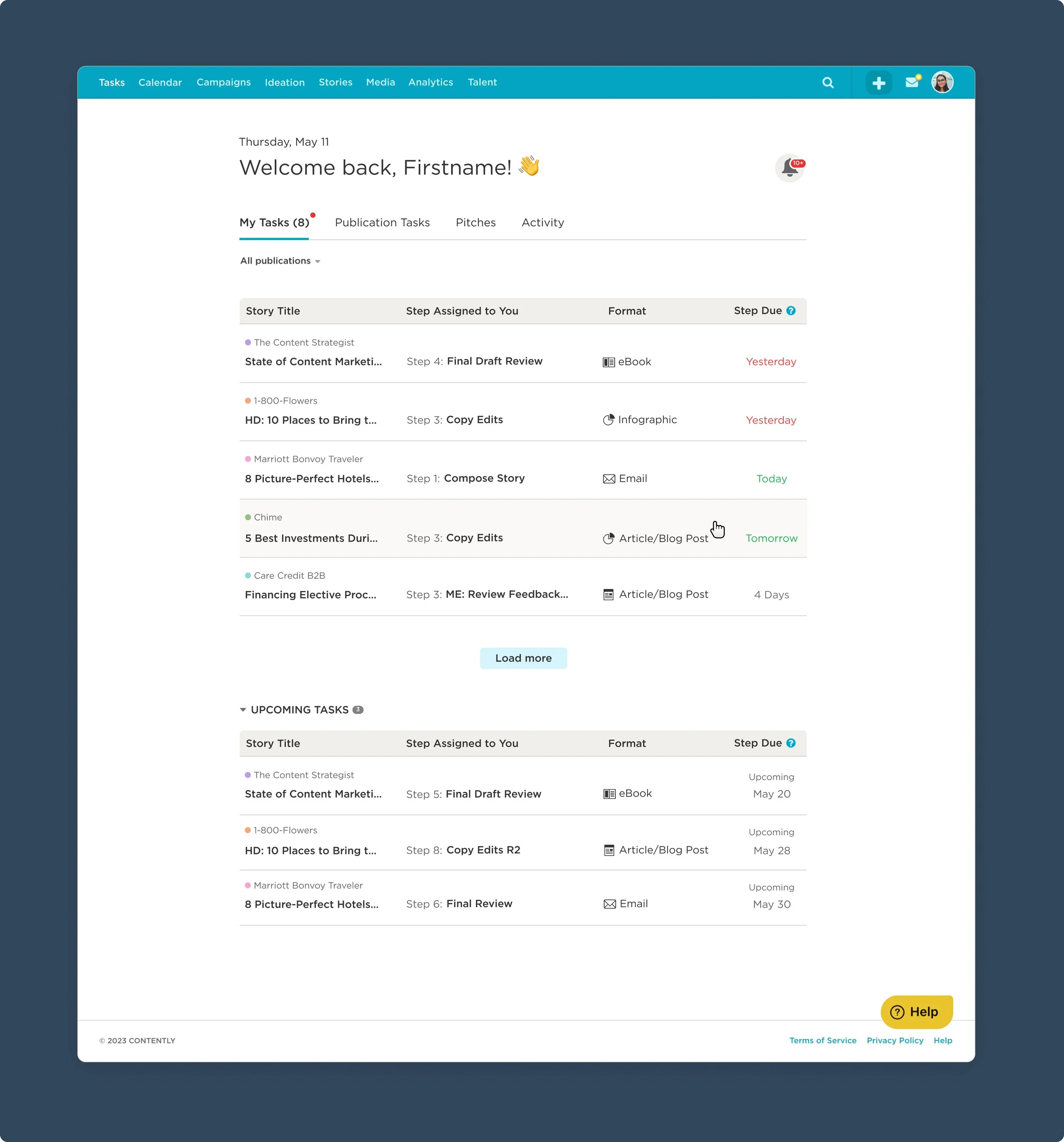
FINAL
Design Prototype
Fine-tuned a tabbed navigation, created scannable tables that can collapse from view for users to focus, and added kabob interactions to the Publication Tasks list for Managing Editors to clean up all of their projects in one, centralized location.
Positive Feedback
& Future Requests
After launch, we added a banner linking to a Typeform to collect anonymous feedback for future iterations. Responses were overwhelmingly positive—users praised the Tasks page’s clarity, scannability, and helpful look-ahead, with a few suggestions to improve it further.
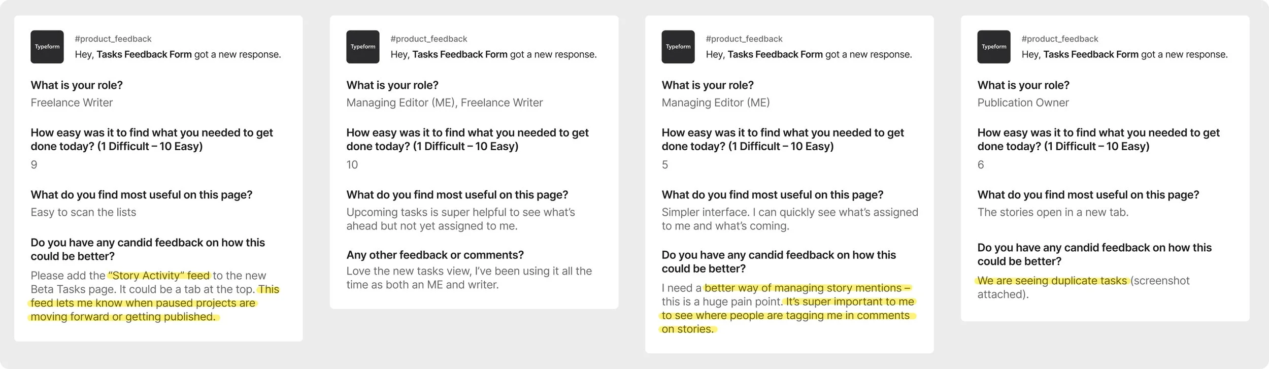
“I use a spreadsheet to manage my 50+ projects for this platform.
This is everything I didn’t know I could have, SHOULD HAVE, asked for…”
Post-Launch Results
& Metrics
Within two months of launch, the Tasks Page reached 50% adoption, and became the #2 most-used page with 98% fewer bugs reported than previous feature launches. It also boosted product engagement (PES +2) and became an NPS “Promoter.”
98% Fewer Bugs Reported
Compared to Previous Feature Launches
#2 Core Page
Second Most-Used Page
(Text Editor being #1)
50% Sustained Usage
Throughout the Year
NPS Promoter
Customers giving 9s and 10s on NPS Survey
Key Learnings
& Next Steps:
When products try to do everything, users struggle to do anything.
Balancing Legacy & New Users is Tough: Veterans rely on muscle memory and workarounds, so even small changes trigger frustration, while new users struggle to understand a platform shaped by old habits.
More Features ≠ More Useful: 13+ year old products become difficult to sunset features for fear of losing customers. Lots of risk assessment, user interviews, and research go into this process.
Next | Continue Measuring Impact: Correlate Tasks Page usage to churn and acquisition to prove business value.
Next | Dense Table UI Ideation: Bringing the product to parity made the table information on the “Publication Tasks” really dense, I’d like an opportunity to simplify.
Other Projects with this Company:
Integrations with Linear Workflows · Collaborative Text Editing · AI Tools for Regulated Industries · Freelancer Search Improvements · Freelancer Profile Improvements (hundreds of live portfolios were destroying SEO for this company, portfolios were being created for “male enhancement drugs,” etc.) · Infinite Amount of Flows & Features after 2+ years working together