Membership-Based Concierge HealthcareSollis
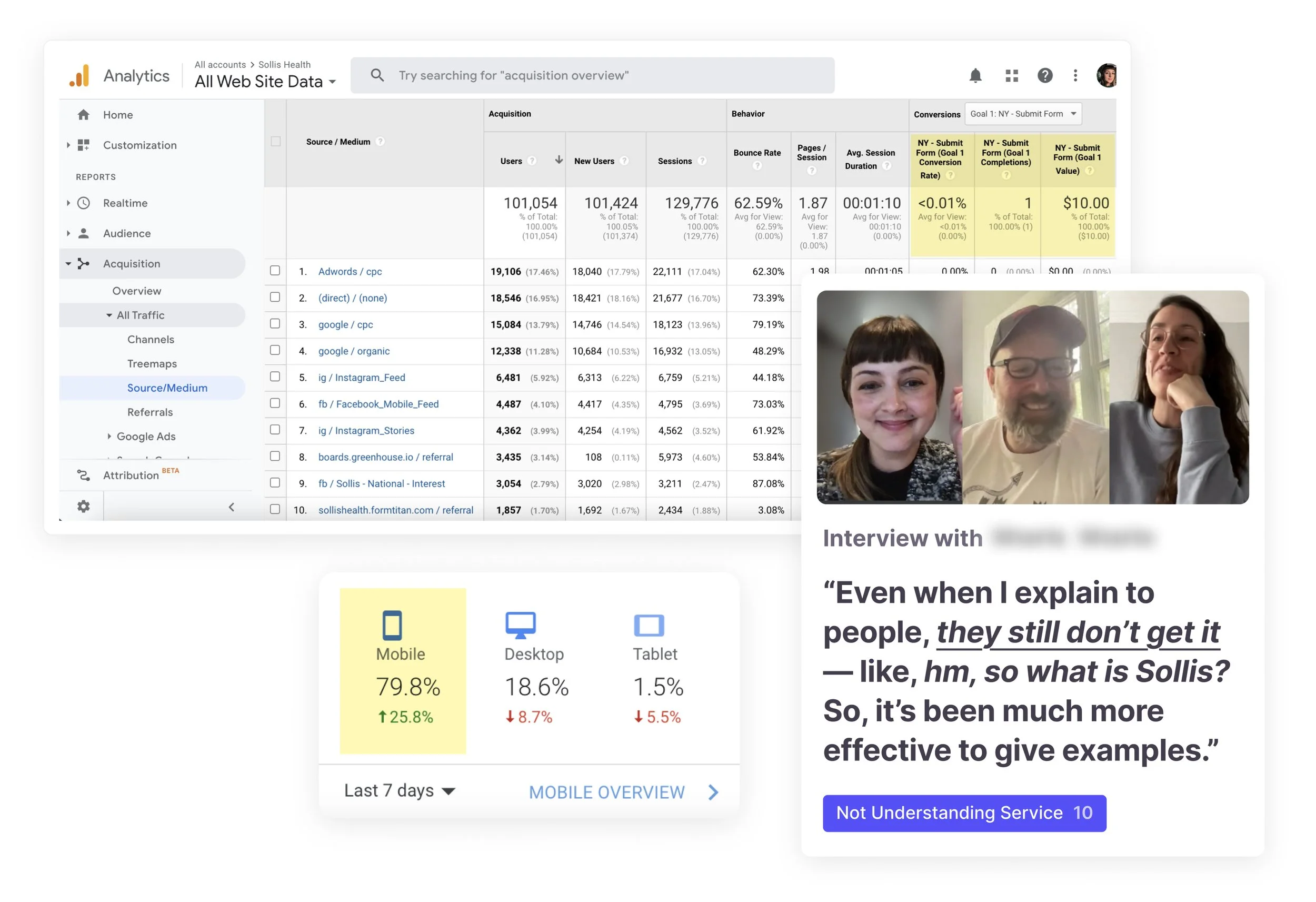
Clicks, but no conversions
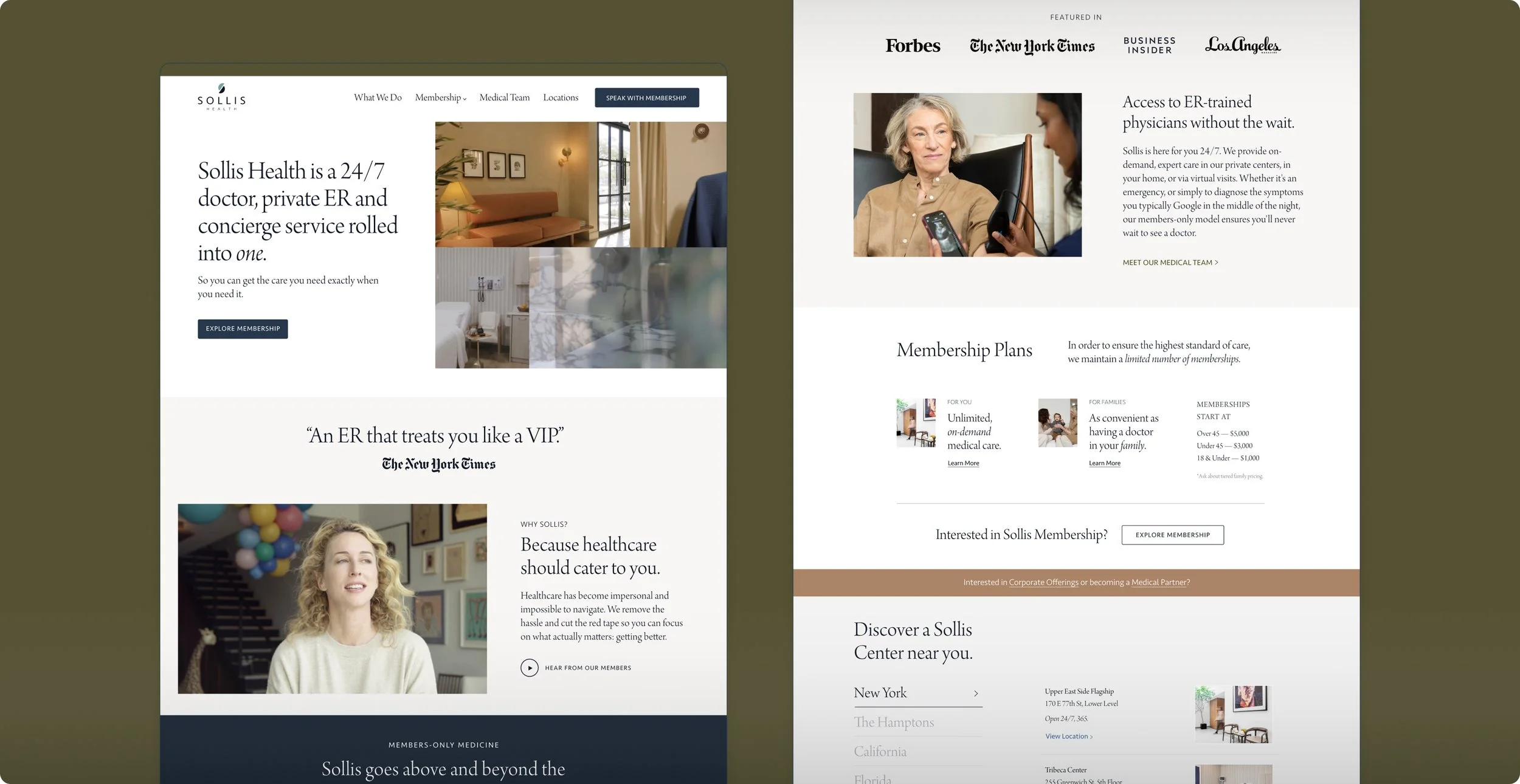
Sollis Health is a membership-based 24/7 doctor, private urgent care, and concierge service rolled into one. They provide on-demand, expert care in their private centers, in your home, or via virtual visits.
“Five-Star Hotel meets Urgent Care”—where members skip the wait and doctors make house calls.
Goal
Transforming site into elevated brand experience and powerful growth engine.
Led the branding, messaging, and mobile-first website and marketing efforts that turned confusion into conversion. Suddenly, visitors stopped bouncing from the site and started applying for memberships—and ad conversions shot up 540%, all without changing a single ad.
Lead Designer & Art Director
- User Interviews
- Design System Update
- Brand Messaging/Copy
- UX/UI Design
- Mobile-First Redesign
- Conversion Optimization
- Hiring/Managing
- QA
Timeline: 8 Weeks
- UI/UX: 4W
- Dev: Simultaneously
- Approvals: 4W
Results
- 3x'd Daily Revenue
Day of Launch Onward - Increased membership signups by 30×
Day of Launch - 540% Ad Conversion Increase
Visitors stopped bouncing—and started applying. - Traffic surged +25% MoM
Users Up 24.5% and Sessions Up 20.7%
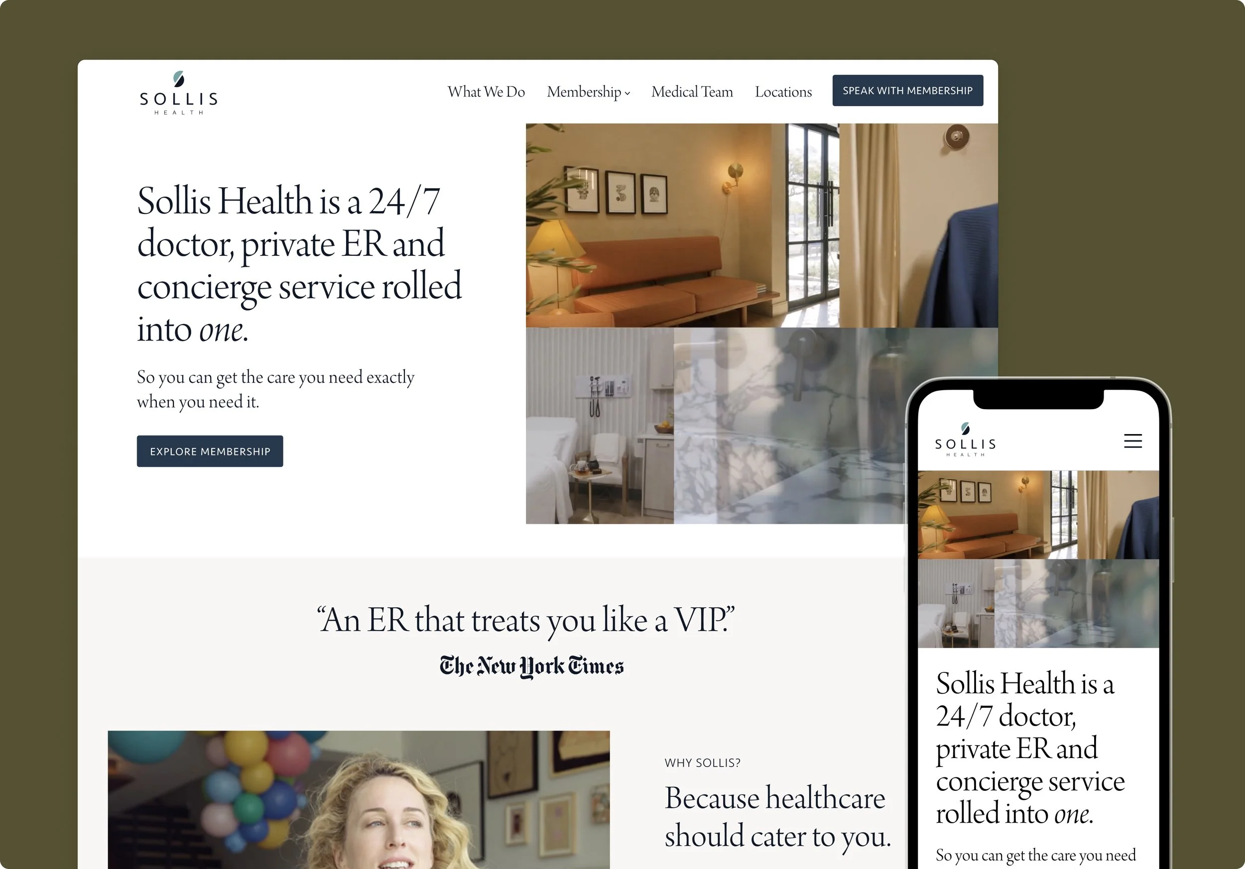
THE SOLUTION
Mobile-first site reflecting the brand’s luxury experience and clarifying membership.
Rebuilt the website reflecting luxury branding and SEO best practices. By clarifying memberships, addressing insurance questions, and grounding pages with location context, we turned ad clicks into paying members 3x daily revenue from the day of launch onward and cut drop-offs from 90% to 3%.

THE PROBLEM
Clicks, but no conversions
Despite heavy ad spend, most visitors dropped after landing on the site. The website failed to reflect Sollis’s luxury brand or speak directly to qualified leads—leaving marketing dollars wasted and sales stagnant.
Bounce Rate >70% from Paid Ad Traffic
Clicked Ad → Immediately Left Site
90% Funnel Drop-Off
Started to Fill Out Membership Form → Quit
Less Than 1% Conversion Rate
1/100 Visitors Actually Filled Out Form :(
DESIGNING FOR CONVERSIONS
Conversion Need #1
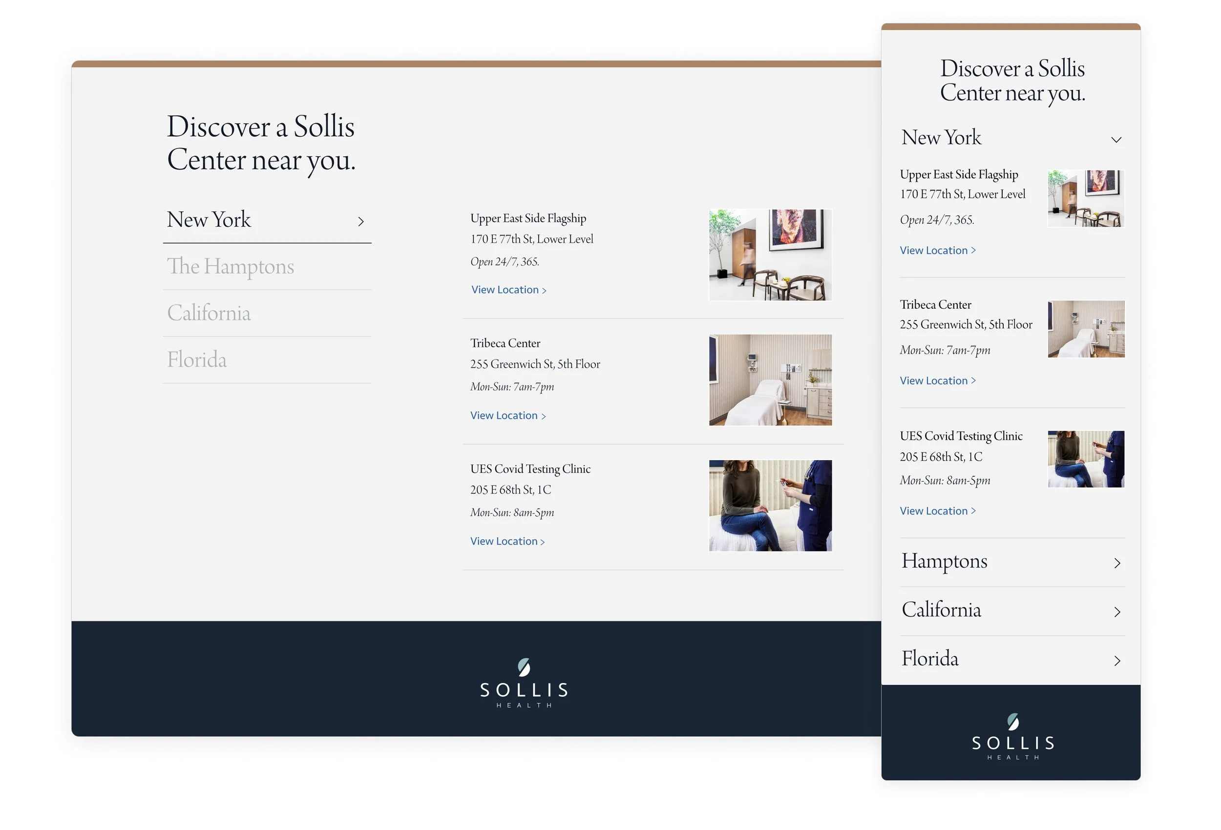
Near a Physical Location & Doctor Bios
Proximity is key for urgent care and house calls, and members wanted short bios on who was treating them — even if they couldn’t choose their doctor.
Conversion Need #2
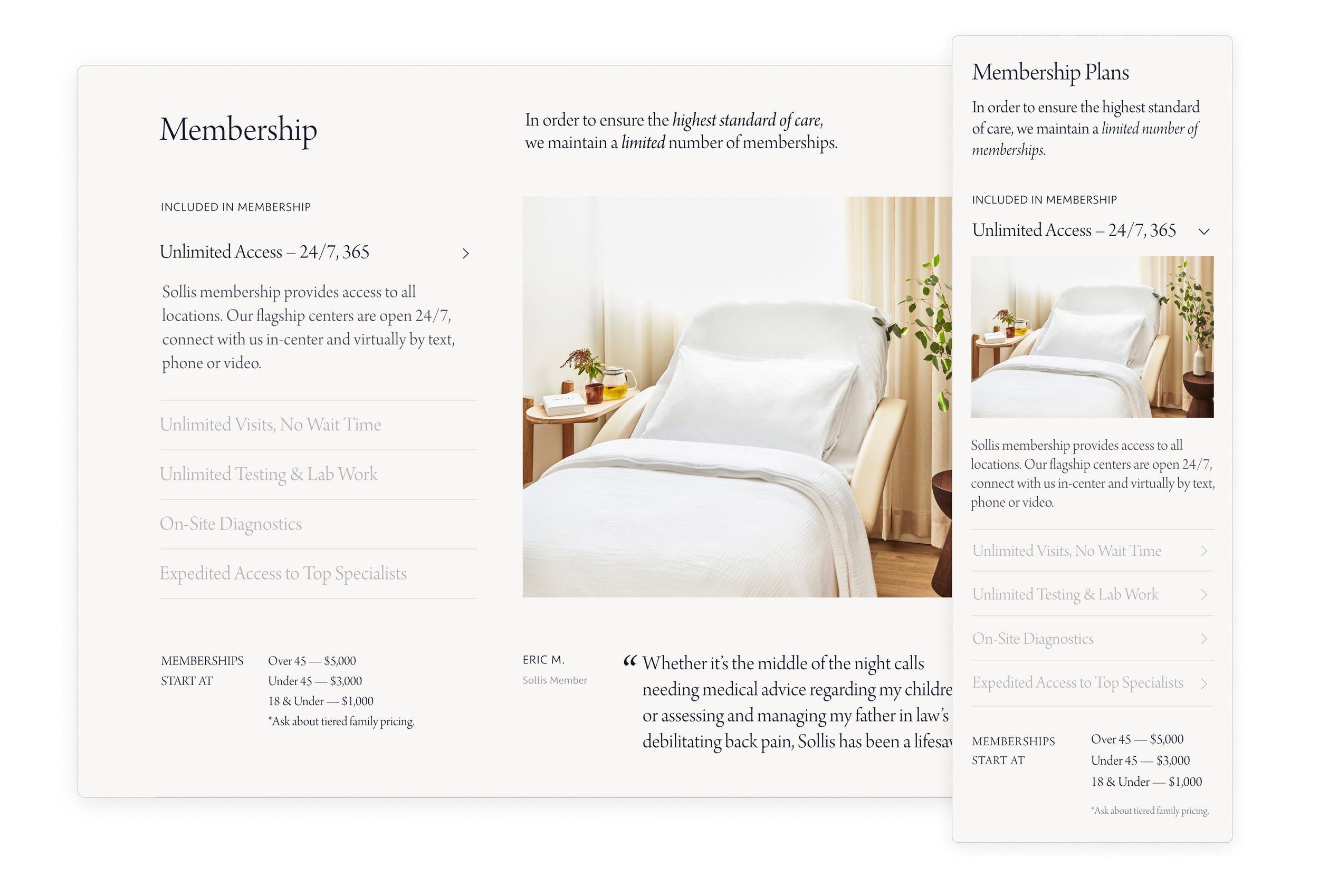
Membership Packages & Pricing
Transparency around membership tiers and pricing was pertinent, including their B2C, B2B, and B-to-Med Partners offerings. Buh-bye one sheet pdfs! 🫡
Conversion Need #3
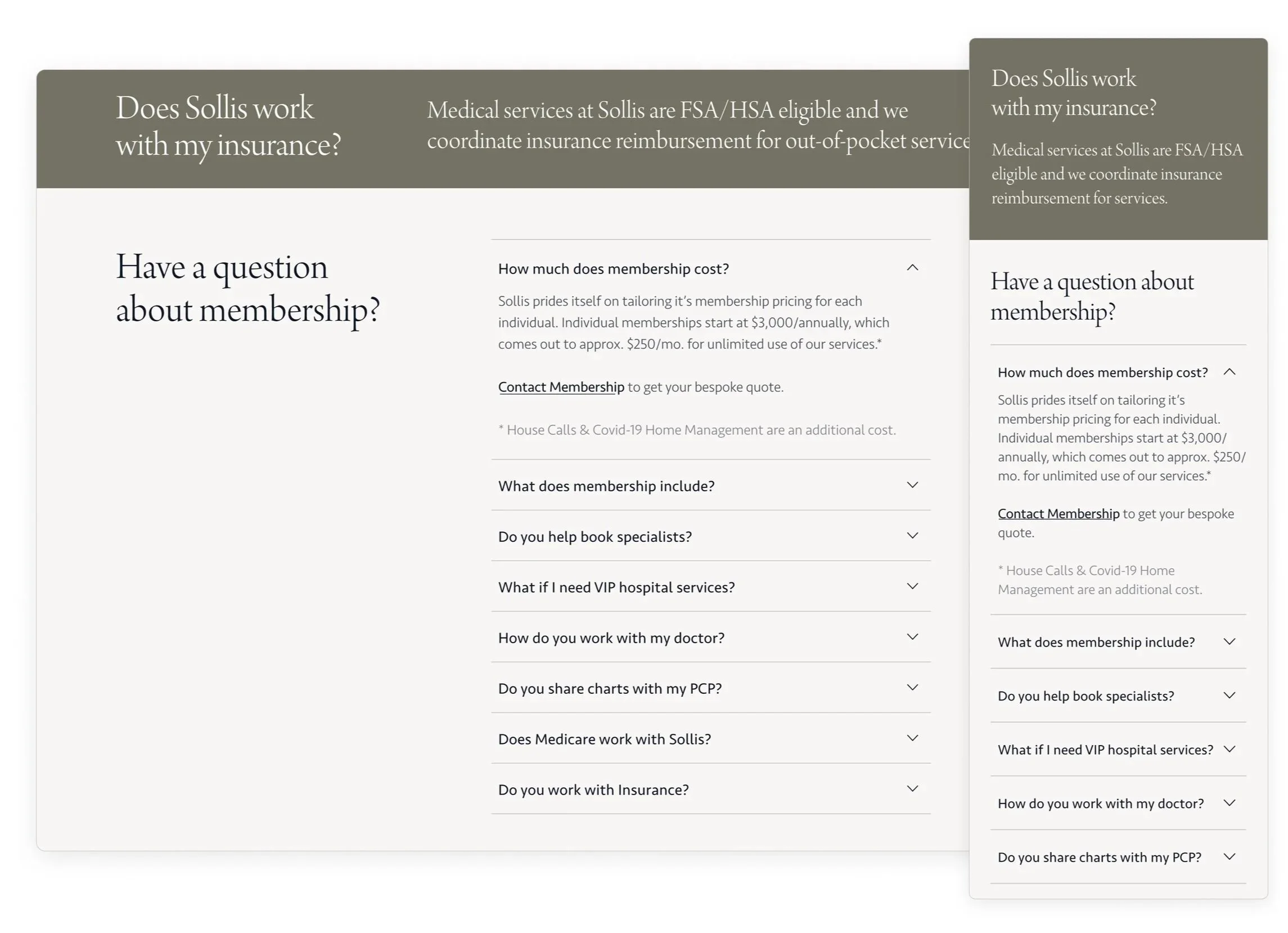
Questions on Insurance & Medicare
Clarity around what was covered by Insurance or Medicare was a top concern for everyone — regardless of income or celebrity status.
DESIGNING FOR CONVERSIONS
Design
Based on my research, I ensured that the site spoke to real-life reasons why you’d need Sollis in your life. I also created transparency around membership and pricing, answered common questions about insurance coverage, and highlighted locations with details about the doctors.
SCALE QUICKLY
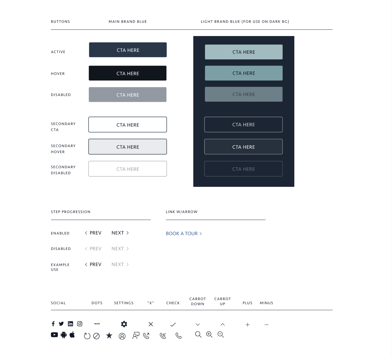
Design System
I created hundreds of ads visitors clicked, but analytics showed they dropped off once they reached the site. I unified the brand and visual systems, building a design system that kept the brand consistent across touchpoints and made it easy to scale landing pages and features fast—transforming a 70% bounce rate into a 540% conversion lift.
Post-Launch Results
& Metrics
The redesigned site 3x’d daily revenue day of launch, increased conversions by 540% within 3 days, and cut form drop-offs from 90% to just 3% while fueling month-over-month traffic growth, with users up 24.5% and sessions up 20.7%.
540% Ad Conversion Increase
Within 3 Days of Launch – Not Touching Ad Creative
Drop-Off Reduced from 90% to 3%
Visitors were Applying for Memberships
Traffic surged +25% MoM
More New Users and Repeat Visits
👍 Qualified leads began completing optional form fields, giving sales team richer context and increasing memberships.
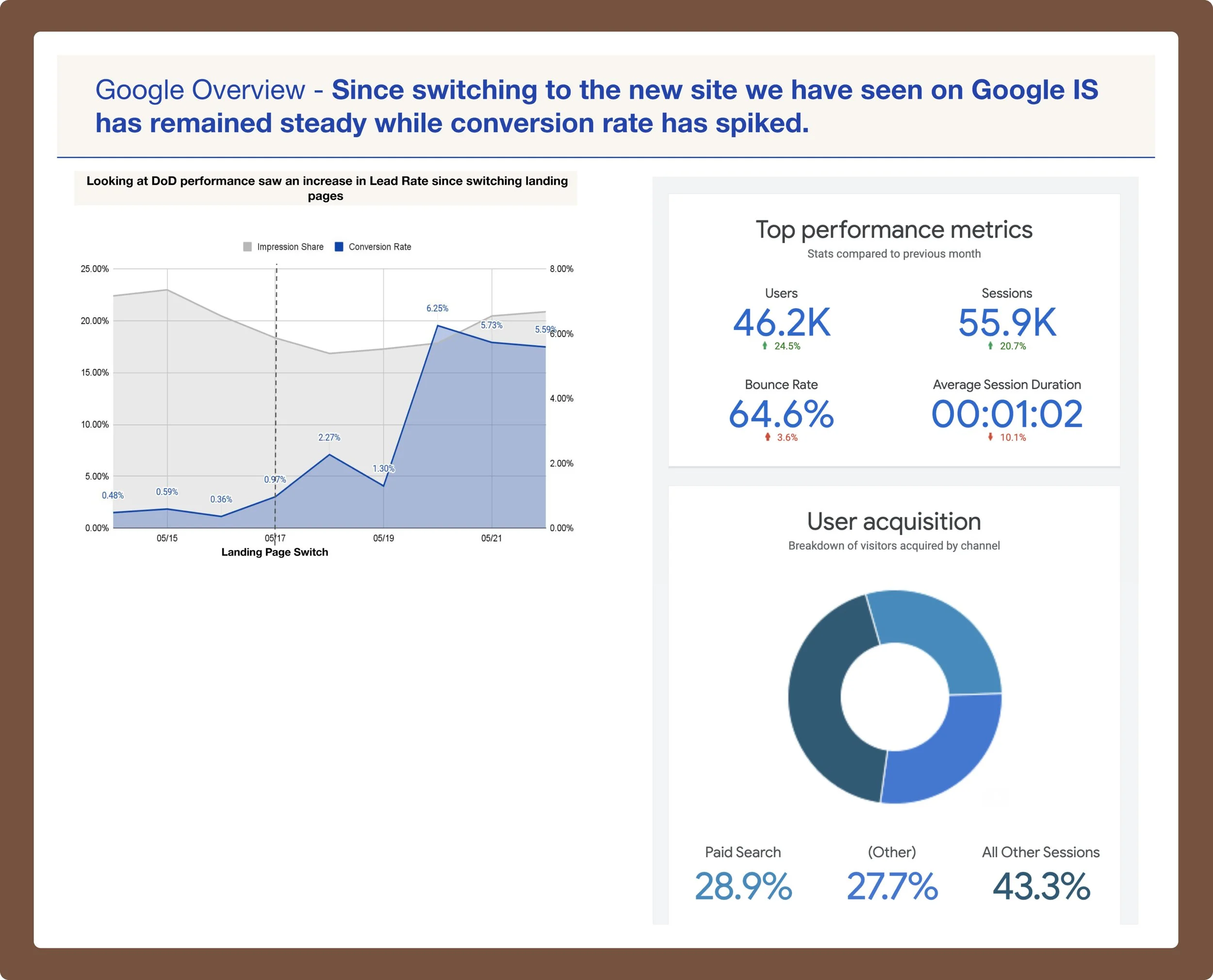
✅ These metrics confirm that after launch, traffic grew, users engaged more efficiently, and conversions rose — even though bounce rate nudged up and sessions shortened, that’s consistent with a funnel that’s working better.
Key Learnings
& Next Steps:
If your site doesn’t explain it, even the best marketing can’t save it.
Impact Can Be Immediate: Most redesigns take ~90 days to show results—this one drove $3M in sales within 3 hours of launch.
Confirmed my hypothesis: The ads were working, but the website wasn’t. By redesigning the site—without changing any ad creative—we unlocked immediate results, proving the site was the weak link in the sales funnel.
Cross-Team Insights Matter: Interviewing sales, customer success, and all other teams revealed what prospects needed most, letting me translate complexity into simple web pages—no more bloated decks—making everyone’s job easier.
Next | Membership App Design: The updated web presence created a foundation for a membership app, expanding convenience even further.
Other Projects with this Company:
Paid Digital Ad Designs · Video Ads · LinkNYC Ad Campaigns · Lead Nurturing Drip-Campaign · Emails, Print Brochures & Materials · Signage & Sourcing for Spaces · Rough Membership App Wireframes